


While the outdoors cool down, interiors are cozying up to fall color schemes. It comes as no surprise that the season’s change certainly brings the warmest hues to life, but cooler tones are making a statement as well. Better yet, while fall-inspired, these shades can be incorporated into your interior any time of the year. Read on as we share the top fall color palettes sure to give your home an autumnal lift.
1. Teal Fall Color Schemes
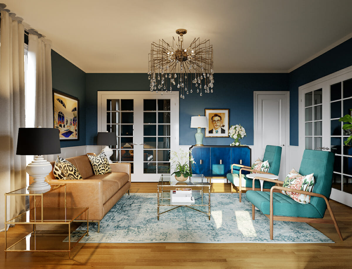
In all its forms, teal, is one of the best-loved colors of the decade. And it’s no wonder as the greenish-blue hue is reminiscent of a serene lake. Peaceful, tranquil, and rejuvenating, teal is the perfect subtle highlight a fall color palette needs. Paired with beige, an interior is soothingly natural.
Tips for a Teal Color Palette
- Teal comes to life even more paired with complementary tones like coral, navy, cream, gold, or brown.
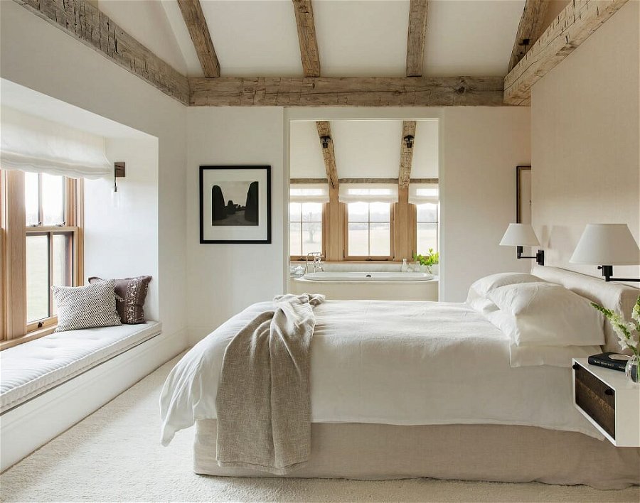
- Highlight a ceiling and exposed beams by painting the surface in a bright contrasting teal while leaving the wood natural. It will add an interesting feature to your home as well as feature architecture often overlooked.
- Incorporate teal-colored decor into a grey interior to energize the overall look.
Love fall color schemes, but not sure which one is right for your home? Then, schedule a Free Interior Design Consultation to learn more and get started on your online interior design project today!
2. Green Fall Color Palettes
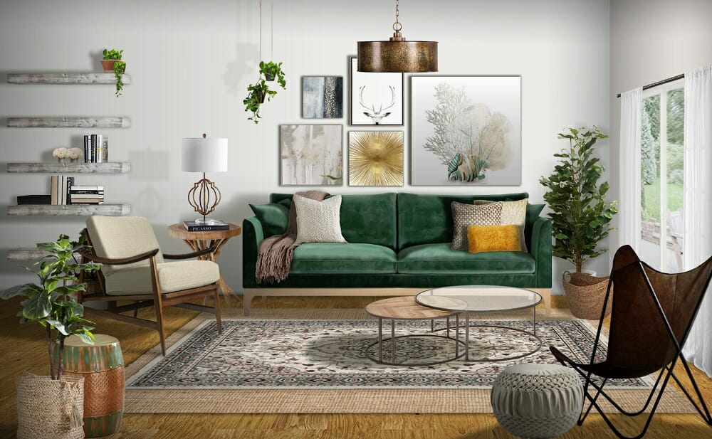
Fall decorating ideas and color schemes wouldn’t be complete without green. Deep, rich hues, reminiscent of evergreen plants, pair well with browns and other seasonal colors to create a pleasant natural look. It is also an uplifting color that can promote feelings of revitalization, harmony, and balance.
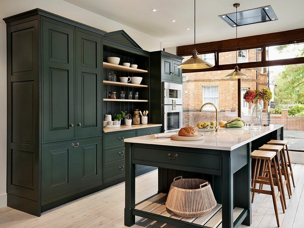
Tips for a Green Color Palette
- Olive green and moss make equally beautiful wall colors. To keep to an autumn color palette, pair beautiful green walls with shades of orange and grey.
- You can accessorize with evergreens or darker plants that flourish in cold climates. Place your healthy plants in beautiful maroon, yellow, and wheat-colored pots to suit the season even more.
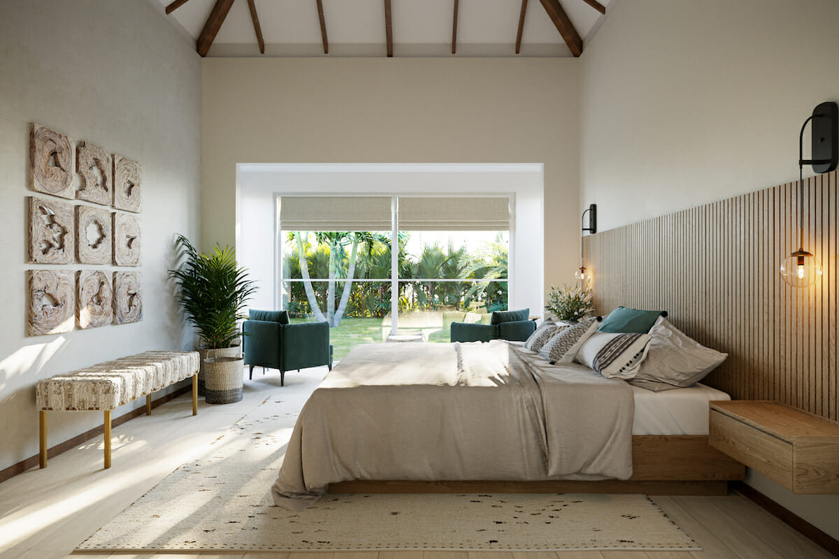
- Incorporate green upholstery in velvet, a favorite fall decor trend, for a luxurious and warm look.
3. Mustard Autumn Color Palettes
Mustard, the sunniest tone of all, brings a ray of happiness into fall color schemes. As the yellowish color stimulates the brain, a little goes a long way. On the other hand, the energizing effect of yellow can uplift you on dreary, overcast days. Besides, mustard, alongside reds and browns, is one of the colors most reminiscent of autumn.
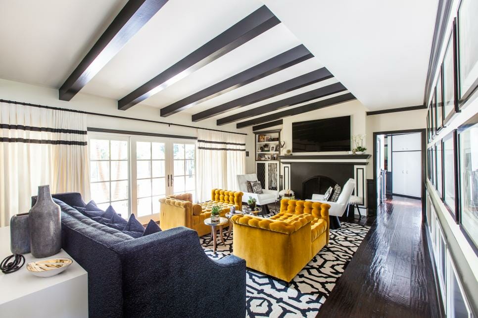
Tips for a Mustard Color Palette
- Add sunshine into your fall interior with a white and mustard color palette. Soft yellow throws and accessories in a light-filled white bedroom will enhance natural light.
- Place mustard décor in front of a cool grey background to make it stand out even more. Not only will the accent color pop, but it will also warm up the room.
- Brighten the kitchen with a mustard backsplash. It’ll go well with cool dark colors, neutrals, and monochromatic fall color schemes.
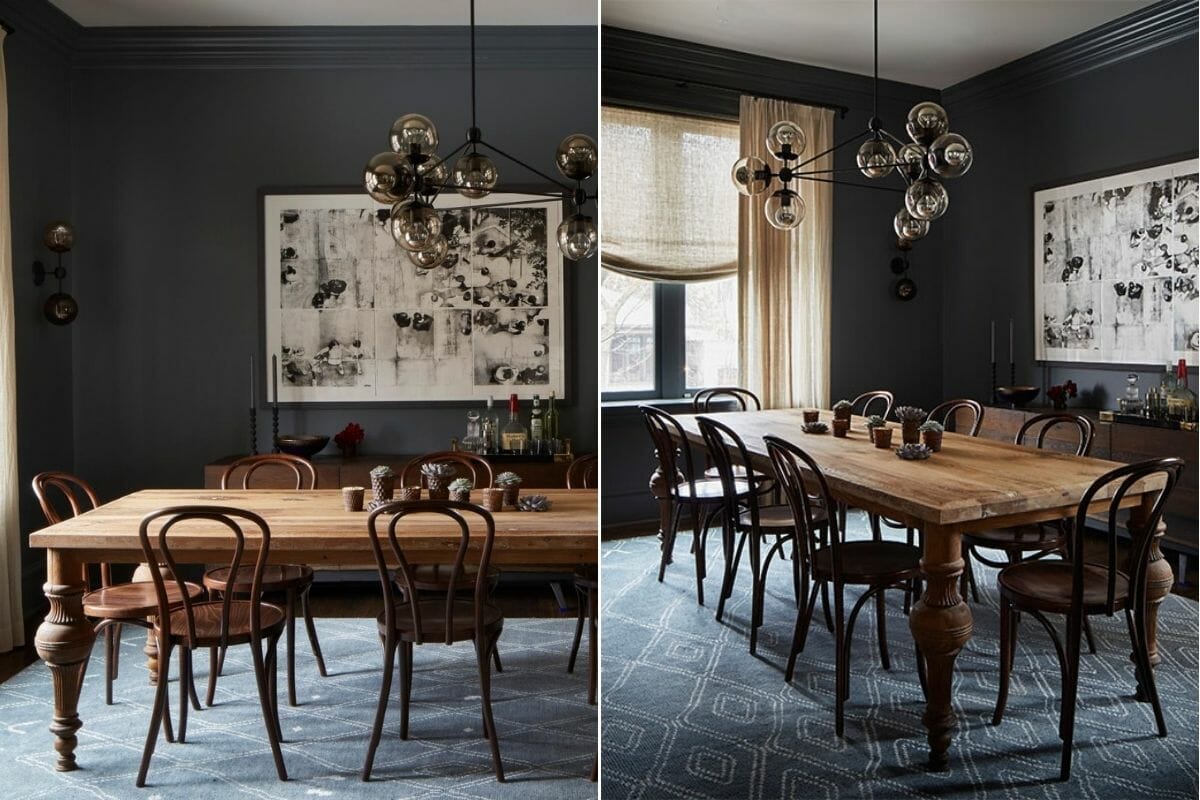
4. Brown Fall Color Schemes
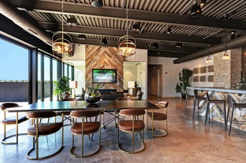
Nothing makes a room quite as cozy as chocolate and almond browns, and few things could be more representative of the fall. The color of fall foliage, leather, and coffee also add warmth to an interior. But too much of a good thing can turn into the opposite. So, keep your interior looking fresh by balancing browns with contrasting or complementing tones like white, black, and green.
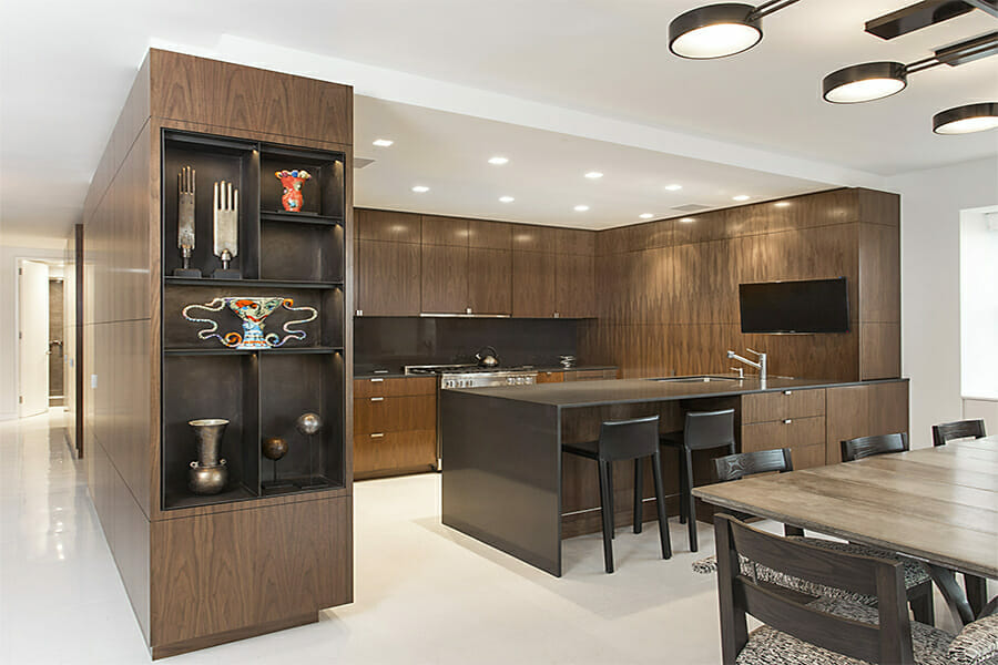
Tips for a Brown Color Palette
- Layer different shades of brown for depth. Almond, latte, chocolate, mushroom, and coffee can enhance the interior with its highlights and shadows.
- Stay away from making mid-tones the primary hue. Choose either a light or dark base color from which to show off other elements in your room.
- Go with a contemporary steampunk or industrial look with leather chairs and metal finishes. In other words, pair brown with copper and black for an impressive interior.
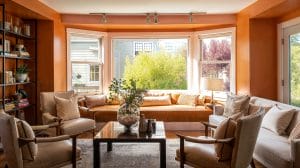
5. Burnt Orange Fall Color Palettes
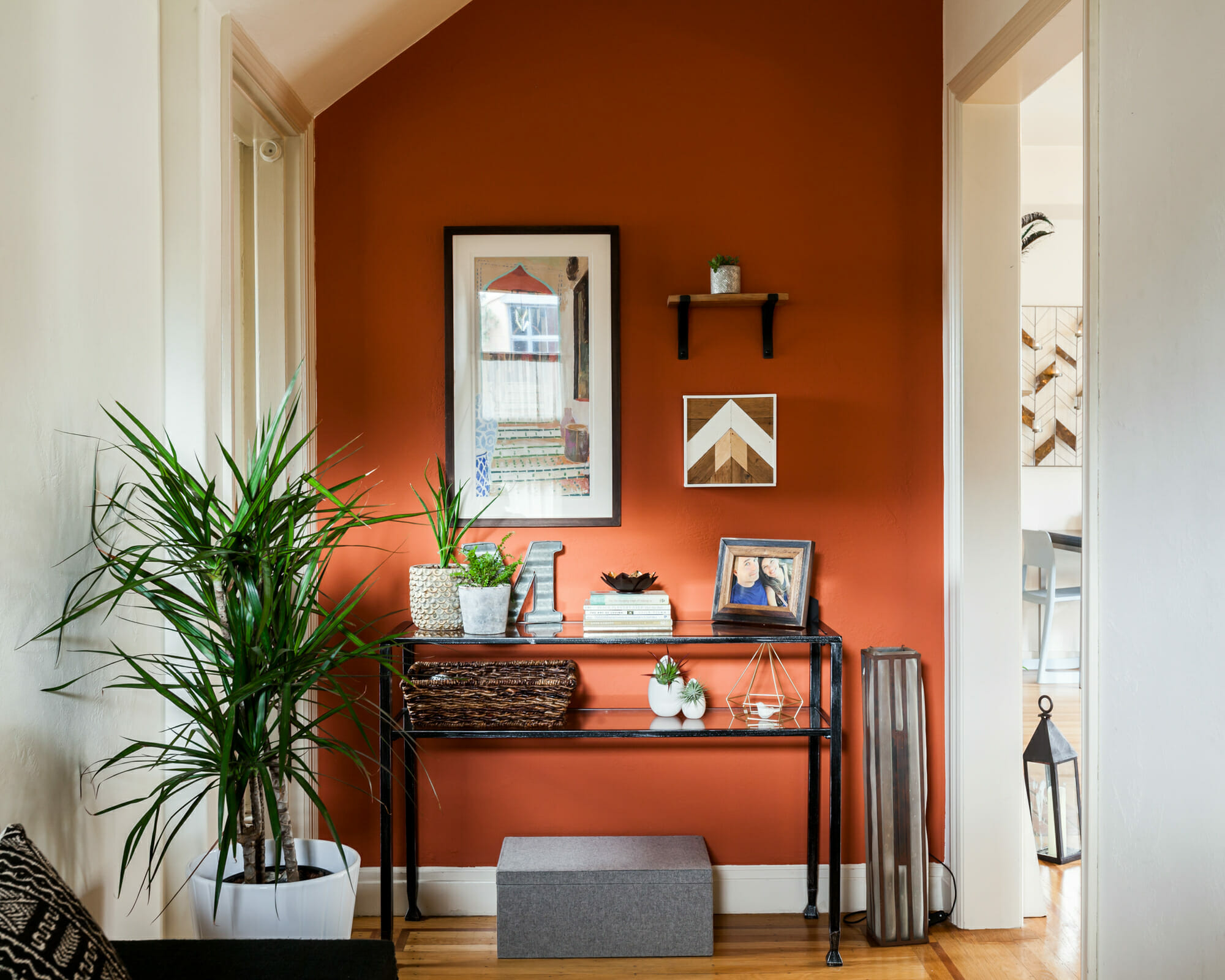
One hue to surely liven up a cool interior is orange. The touch of warmth can energize and promote creativity, great for spending more time indoors. Unlike bright orange, burnt orange can also be calming. This happy hue can even evoke feelings of sunny days in autumn combined with off-white and green decor.
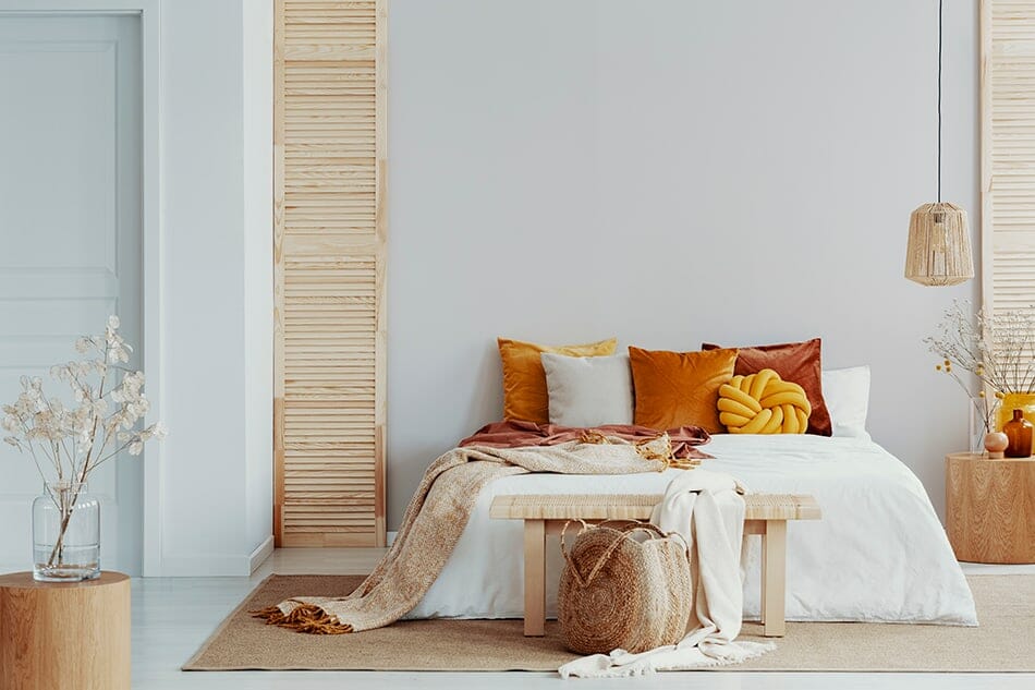
Tips for an Orange Color Palette
- Sienna, pumpkin, or terracotta is excellent as a paint color for a feature wall. But since orange can pack a punch, limit the effect by painting a smaller area, for instance, on a foyer wall.
- A little can go a long way, so liven your interior with brightly colored scatter cushions, a patterned throw, or artwork.
- Update any room with richly colored orange curtains. Textured fabric will also provide a pleasing tactile element that makes the interior more appealing.
6. Dusty Pink Fall Color Combinations
If you want to spark more joy into your interior, a dusty pink autumn color palette is just it. This color scheme can look both stately and traditional, as well as vibrant and playful. Not only do pinks soften a look, but they also bring sophistication and romance into an interior.
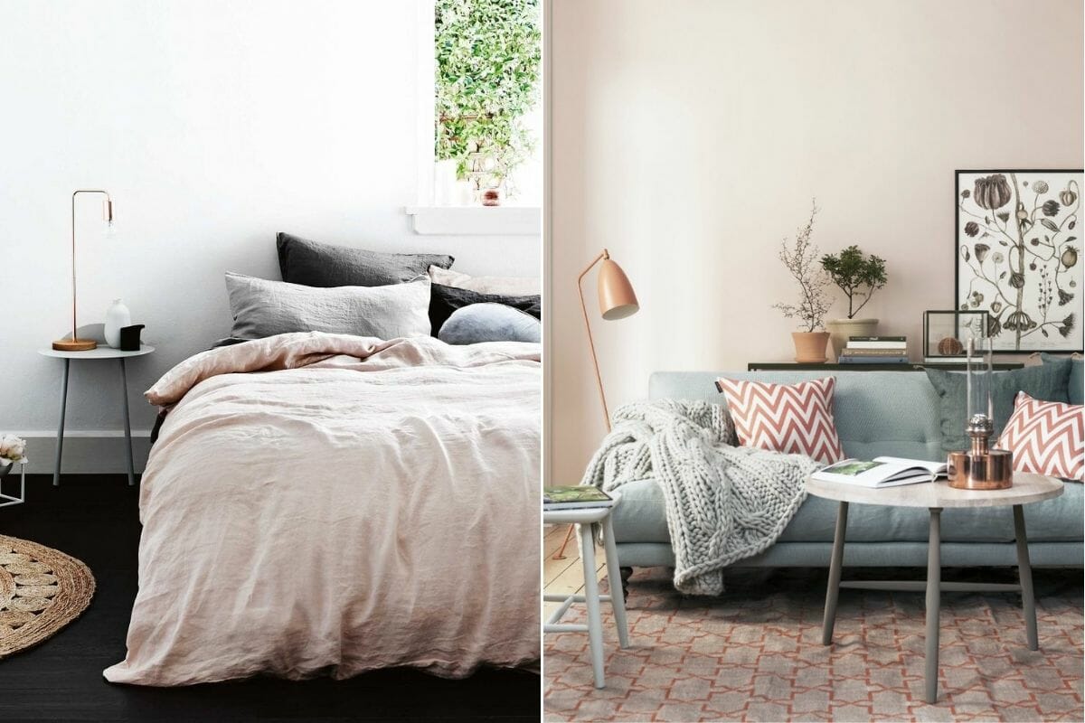
Tips for a Dusty Pink Color Palette
- Dusty pink is such a neutral fall color that it is safe to use as bold décor pieces. A pink chaise longue or fluffy rose rug, for instance, will enhance the room without being overpowering.
- Romantic rosy linen is perfect for a bedroom in fall. Pair feminine bedding with a white or grey chunky wool throw for a contemporary Scandinavian look.
- Add pinks in accessories like a lampshade, decorative bowls, and wall hangings.
7. Charcoal Fall Color Themes
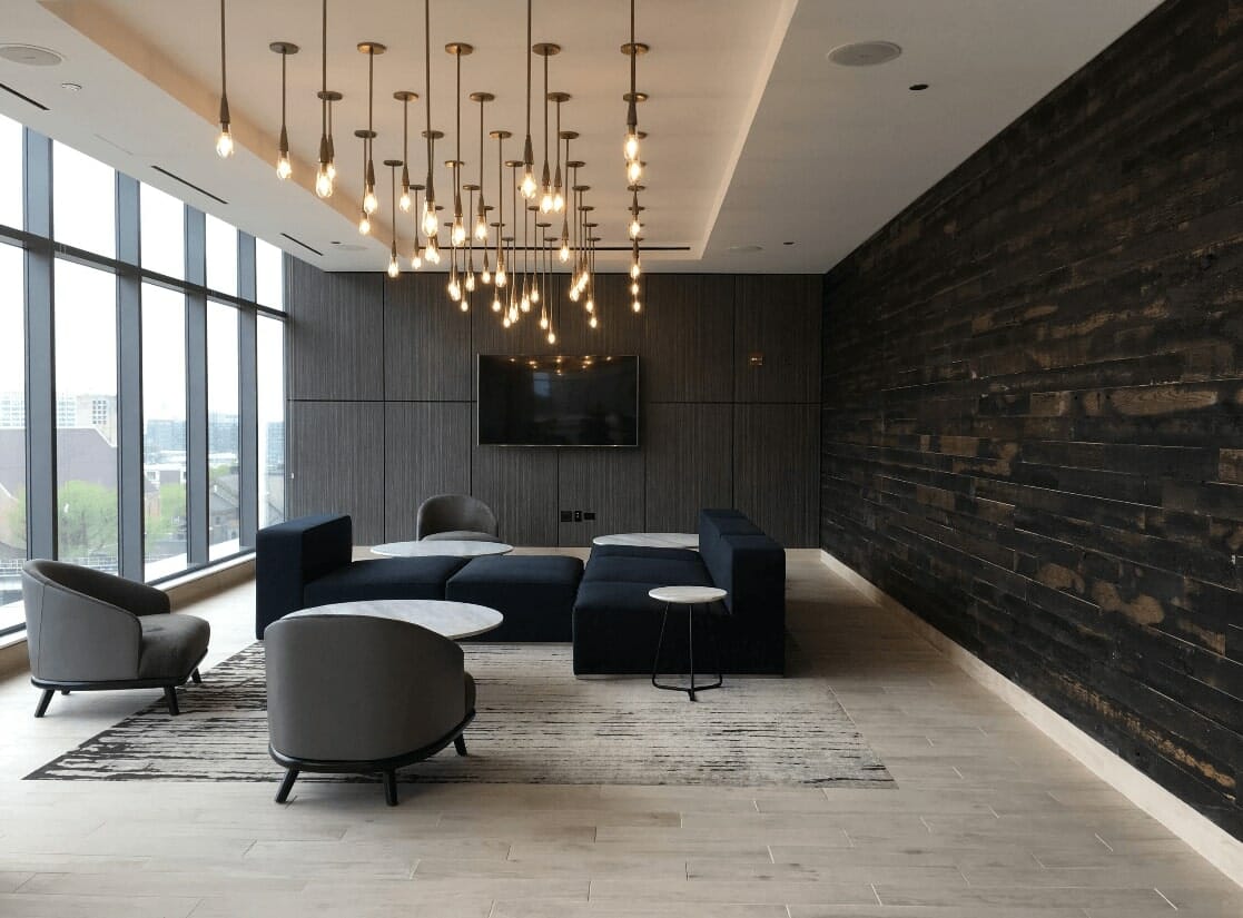
A moody tone like charcoal is perfect as part of a fall color palette. It will not only add depth but can also provide a dark canvas that makes any décor pop even more. As a result, a predominant charcoal interior makes for the coziest and elegant backdrop in the changing seasons.
Tips for a Charcoal Color Palette
- Use charcoal as a backdrop that makes other fall color combinations stand out. A charcoal grey rug, sofa, bed, or walls not only make a statement but also form a base to accentuate accent pieces like art and cushions.
- Use this bold color in a small room, like a dining room, and add red and natural wood accents.
- If you want to play it safe, try adding charcoal accents in light fixtures – think dark lightbulbs, contemporary pendants, or sconces.
8. Eggplant Fall Color Schemes
Soft with a tinge of the dramatic, eggplant is the perfect color for spicing up a fall interior. What’s more, the purple shade is sophisticated enough to use throughout the year: it’s not as bold as its loud cousin and can suit any room. More good news is that eggplant, part of the purple-pink family, comes in many shades, from soft and subtle to bold and bright.
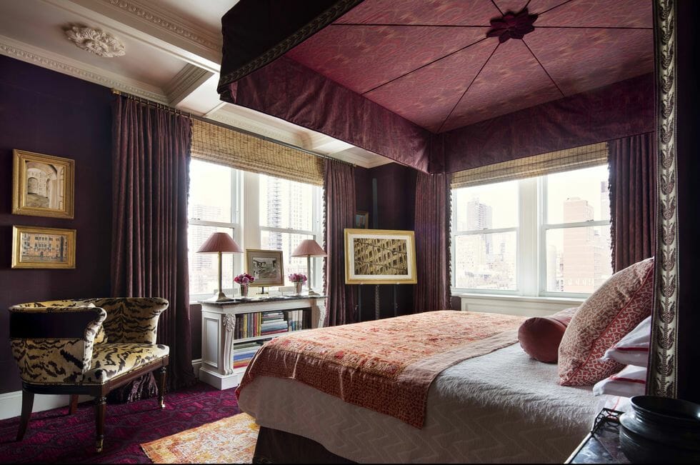
Tips for a Purple Color Palette
- Purple is a rich and luxurious color. Make the most of this quality by incorporating a purple pattern into your fall color scheme. Position scatter cushions on a neutral sofa and add textured and raw accents, like a wood bowl and clay decorative beads, as a final touch.
- Pair a vintage purple chair and an antique graphic wallpaper.
- Mix eggplant with other pinky shades, like mauve, magenta, while grounding these with white and grey for a unique and inspiring autumn color palette.
9. Grey Autumn Color Schemes
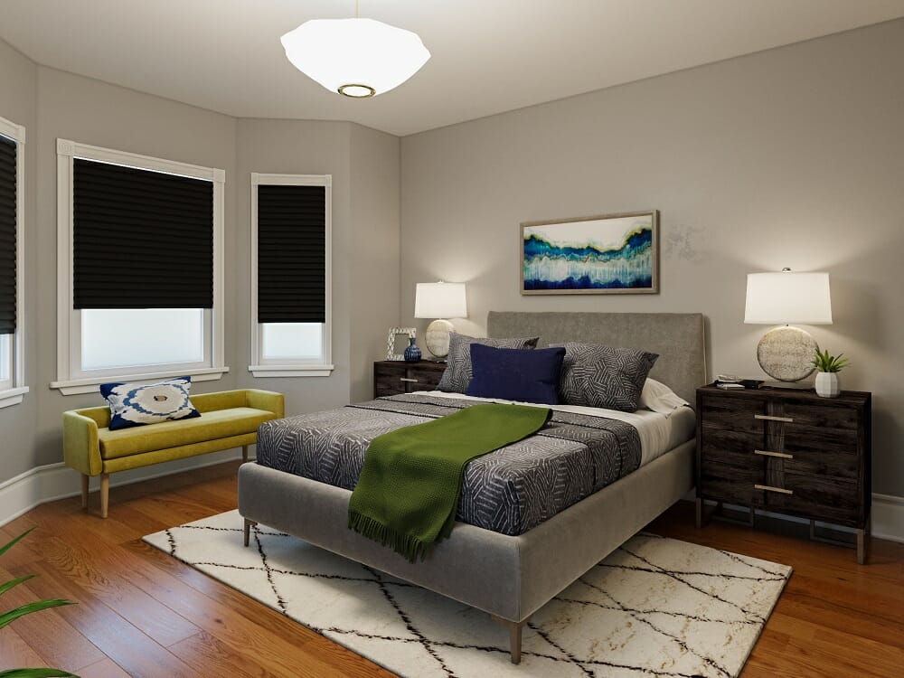
Soothing and relaxing, grey can encourage a tranquil ambiance. Moreover, it is an excellent grounding color for more vibrant hues. Against a grey autumn color palette, the colorful decor is even more distinct. So, if you want to accentuate a particular piece, juxtapose it with grey furniture.
Tips for a Grey Color Palette
- Layer different grey tones, like warm grey and blueish grey, to add visual depth to your interior. Also, ensure these have various light and dark qualities.
- For a neutral alternative to bold dark colors, swap out navy or black for charcoal instead.
- Familiarize yourself with the undertones of grey, specifically the ones you want to incorporate into your home. Grey can have a green, brown, or blue undertone, which will affect your color scheme.
10. Wheat Fall Color Themes
For a comforting, warming interior, wheat is just the thing. The neutral hue is perfect for minimal interiors that pay homage to the natural world. Set against complementing fall colors like yellow, green, or red, you can create an impressive aesthetic.
Tips for a Wheat Color Palette
- As part of the beige family, wheat is the ultimate neutral. Pair it with white and natural materials like stone, wood, and clay.
- As a great base color, wheat doubles as a grounding hue that lets a fall color scheme come to life. For instance, set a plush wheat-colored rug can bring a room together.
- Since wheat is a natural color, incorporate it through organic textures in your décor, like linen.
Ready for a seasonal boost but need a little help incorporating fall color palettes? Schedule a Free Online Interior Design Consultation for expert assistance getting started today!


[images: 1, 2, 3, 4, 5, 6, 7, 8, 9, 10, 11, 12, 13, 14, 15, 16, 17, 18, 19, 20, 21, 22, 23]


Comments