


Patterns are found everywhere in our natural and designed worlds. From the gorgeous curvy spirals of a sea shell to sharp geometric shapes of a city skyline, these repeated designs make an aesthetic difference in our spaces. But, enhancing an interior design is more than simply throwing in elements of pattern. There’s a bit of a science to it. While sticking with solids is a safe way to go, there’s no reason to shy away from pattern in a room when it adds richness and design interest.
Below are some things to consider when incorporating patterned accents into stylized rooms. For a little more help, let a designer consultation give additional personalized guidance!
Seek inspiration
Sometimes it’s hard to know where to start when selecting and combining patterns. First thing’s first: try the room itself. Is there an adored piece of art, a favorite hand-made quilted throw, or even the view outside the window that is inspiring? Using existing elements in a room design can often lead the way. It’s helpful to pick up colors and shapes from such pieces. Starting with a blank slate? A visit to well curated Pinterest boards, can quickly encourage creative vision.
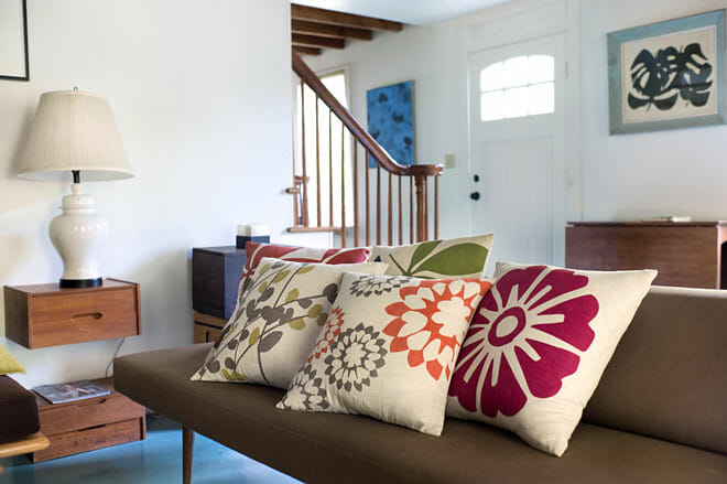
Color definition is key
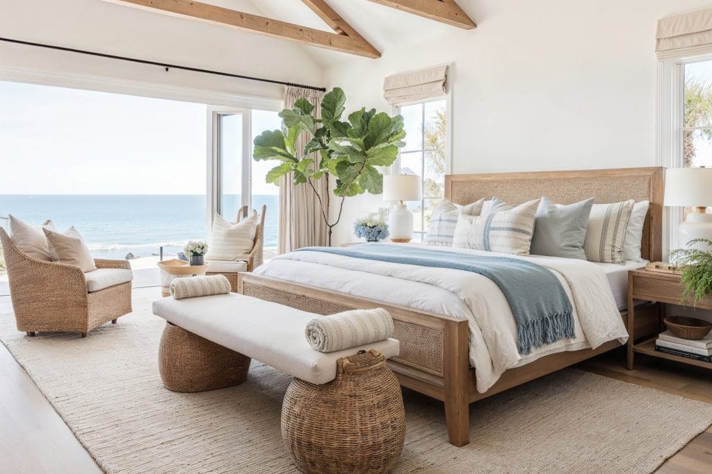
Whether wanting an airy white palette or a punch of color that makes an impact, color is nothing to take lightly. Staying within the same range of color intensity is a good rule of thumb when mixing patterns. Combining pastels with vibrant tones can be confusing when patterns are involved. Stripes, checks and large florals will jive more if their hues are aligned.
Similarly, when choosing whites, being within the same family (off whites, creams, bright whites) is more aesthetically alluring than mixing whites which often results in one standing out. Add interest by introducing stripes, geometric shapes or texture within that shade.
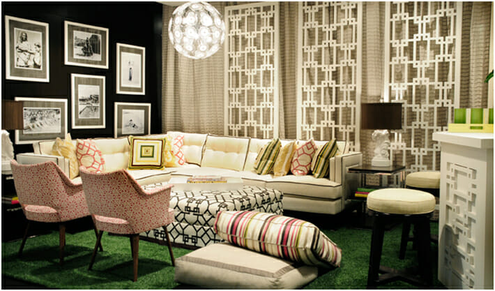
Neutrals power!
Everyone has their own comfort zone when it comes to accessorizing with textiles and patterns. Some gravitate towards color while others like to play it safe with neutrals. According to New York textile designer, Judy Ross, neutrals help create cohesion which is why with her designs, the formula includes: color for pop, cream to liven, and neutral for balance. “A lot of people like to have a connecting force with their arrangements, shared Ross in a recent interview for Decorilla designers, “so with the neutral, they can play off it.”
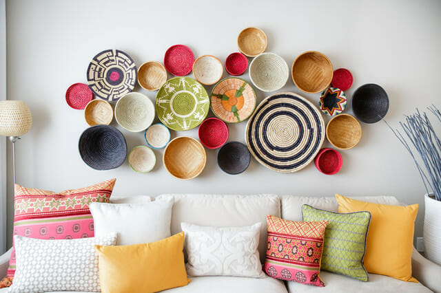
Scale is sacred
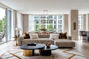
Layering patterns of differing scales brings a design to life! While using the power of threes, a large botanical pattern combined with a mid-sized plaid and a small scaled floral is an example of how to do this. Check out several ways to use floral patterns in varied styles here.
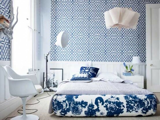
Patterns have feelings too!
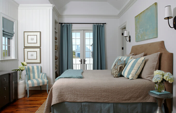
Consider the type of mood desired for a room. Like color, patterns emit a contagious energy. There’s a psychology around how to use color to evoke certain feelings, as this HGTV post explores. This happens with patterns too! Simple and pale equate to tranquility suitable for a bedroom, while busy patterns like a bold chevron or polka dot design amp the energy up.
Patterns have long been the layering secret in impressive room designs. Keep the mentioned tips in mind when decorating your next space.
[image credit: 1, 2, 3, 4, 5, 6]
Written by Decorilla designer, Christine Martin.

Comments