


How do you design a 21-year-old’s electronics lab and a younger sibling’s bohemian room—before either steps foot in the house? This South African family worked remotely with Decorilla to create two distinct spaces that blend function and softness, all coordinated from opposite sides of the world.
The Challenge: Cool Kids Rooms Design + Jack & Jill Bathroom
The clients contacted Decorilla from South Africa while navigating a new modern build in Aiken under significant time pressure. Expert interior design guidance was essential for foundational material and finish decisions ahead of their summer relocation. Architectural plans remained in flux, and remote coordination became central to the project scope. They sought a new construction interior designer capable of integrating select furnishings and art from their current residence while also addressing:
- Design coordination with evolving architectural documents
- Remote project management to advance decisions before arrival
- Development of a cohesive modern aesthetic throughout the home
- Feminine bohemian girl’s room aesthetic with green-forward palette and integration of existing desk and strawberry lamp
- Masculine boys’ bedrooms with clear zoning and a dark green and charcoal palette
Pro Tip: Trying to find the right aesthetic direction for designing your own cool kids rooms? Try our Free Interior Design Style Quiz to discover your ideal style today!
Design Inspiration: Kids’ Room Interiors
The clients began gathering reference images months before construction started, pulling from different sources. Their kids’ room ideas leaned toward spaces that prioritized work zones over decoration, seeking solutions to their specific equipment needs. Their Pinterest selections showed industrial materials like steel shelving along with creative accent walls. At the same time, they also revealed an unexpected pull toward reading nooks and warm wood tones that could soften the utilitarian framework.
Expectedly, the kids’ room design briefs focused less on aesthetic cohesion and more on accommodating distinct activities within one footprint. They prioritized music, written work, computer gaming, and hands-on electronics projects that required dedicated surfaces and tool storage. The inspiration images consistently showed wrap-around desk configurations and built-in cabinetry that turned every corner into functional infrastructure.
Initial Concepts: Finding the Right Designer
Before the project started, the Decorilla team assigned two designers with experience in productive home office layouts and new construction coordination. Kamila A. and Wanda P. developed separate concepts that approached the office and laundry spaces through different material strategies. The clients selected Wanda to continue through subsequent project phases, and she proceeded as the sole designer for the bedroom proposals.
Per the client’s requests, Wanda developed the girl’s bedroom with a soft, bohemian approach. Her proposal centered on pale wood tones, greenery, functional solutions, and layered textiles. The moodboard balanced feminine elements with practical zones for music and study, incorporating the client’s existing pieces into a nature-forward aesthetic.
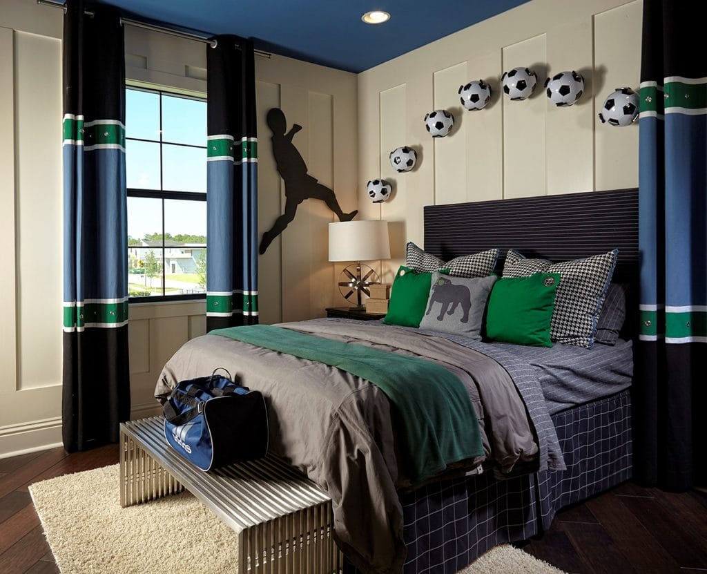
Boys’ bedrooms, on the other hand, took a masculine industrial direction with Iron Ore and Bedrock gray establishing the color foundation. Custom-built-in cabinetry defined the functional zones requested in the briefs, while darker wood finishes and streamlined furniture support the practical, comfort-driven brief.
The clients’ first feedback confirmed the successful alignment of visions: “I’m in LOVE with the color palette! Love it, love it, love it! In terms of style, we are definitely on the right track.“
Modern New Construction Interior Design Series
This new construction project was developed through sequential phases, with each stage targeting a distinct spatial zone within the residence. Remote coordination guided material selection during active construction, beginning with structural finishes and progressing into individual room specifications. That’s why this story spans multiple episodes:
- Before & After: Modern New Construction Interior Design – The Heart of the Home
- Before & After: Modern New Construction – Luxurious Master Suite
- Before & After: Modern New Construction – Creating a Productive Home
- Before & After: Modern New Construction – Welcoming Entrance Areas
Results Revealed: Cool Kids Rooms
This new construction project delivers cool kids’ rooms for siblings with opposing aesthetics, along with a shared Jack and Jill bathroom. The result addresses distinct functional requirements within a cohesive modern farmhouse framework, proving that remote collaboration can produce detailed, personalized outcomes even when ocean distances complicate conventional designer-client workflows.
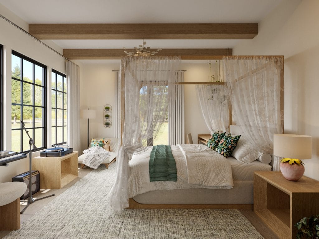
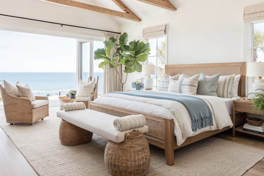
Girl’s Bedroom
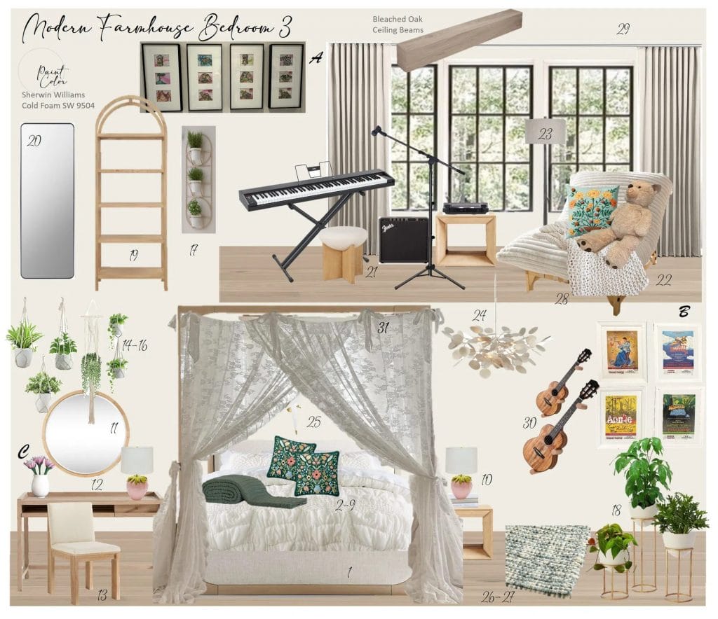
Wanda’s design for the client’s daughter’s bedroom landed the nuanced bohemian aesthetic they requested. The plan started nearly from scratch, retaining only the desk and strawberry lamp from the room’s previous setup. The client’s initial reaction confirmed the direction: “Her room looks amazing. I’m sure she is going to love it!”
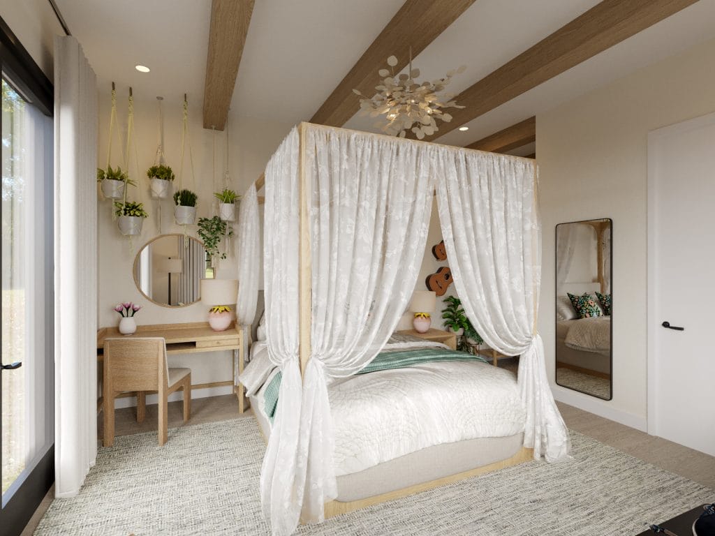
This kids’ room design built its feminine character through layered textiles and organic forms rather than conventional color saturation. It kept the space from reading as overly sweet or juvenile.
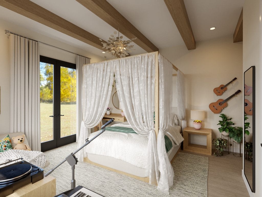
Bleached oak beams cross the ceiling at intervals that ground the upper volume and connect to the canopy bed’s wood frame below. The canopy bed establishes the room’s focal point through sheer white fabric that drapes from a bleached oak four-poster frame. The gauze panels can be tied back or released to enclose the bed zone, which gives control over privacy and spatial definition within the larger room. Above the bed, a modern chandelier with leaf-form arms distributes light while reinforcing the kids’ room interiors’ organic theme.
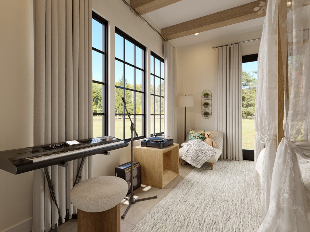
The music and study zones occupy the window wall where natural light reaches the keyboard and desk throughout the day. A simple wood desk with a matching chair sits adjacent to the keyboard stand, creating a continuous work surface that accommodates both written assignments and instrument practice. A low wood credenza beneath the keyboard holds equipment and serves as additional surface area for sheet music or audio gear. The reading chair appears in the opposite corner with a chunky knit throw, offering a third activity zone that balances the room’s distribution of programmed spaces.
The room owner’s response after arriving captured the outcome: “I can’t tell you how thrilled she is about her room. She kept saying—I’m sorry I was difficult, but I just wanted it to be right… and look at it now – it’s perfect!”
Our Picks for the Look
Harmonizing Colors and Textures
The cool kids’ rooms’ design relies on textile layering to establish its material character. Sheer white canopy fabric, chunky knit throws, and jute rugs distribute texture across different functional zones. Meanwhile, the wood tones remain consistent from the ceiling beams down through the furniture pieces, creating vertical continuity. Green appears as accent punctuation, which ties the botanical references together. The result reads as intentionally composed yet flexible enough to absorb new objects as the inhabitant’s interests develop.
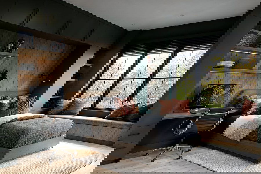
Older Boy’s Bedroom
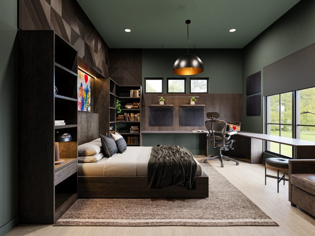
This kid’s room design prioritizes workspace infrastructure, translating his practical requirements into built-in solutions that occupy entire walls. The dark green paint specified in the brief covers all vertical surfaces and extends across the ceiling. The saturated envelope grounds the industrial material palette below and addresses the masculine aesthetic. Custom millwork frames the bed wall and wraps around adjacent walls to accommodate the three-zone desk system the owner requested.
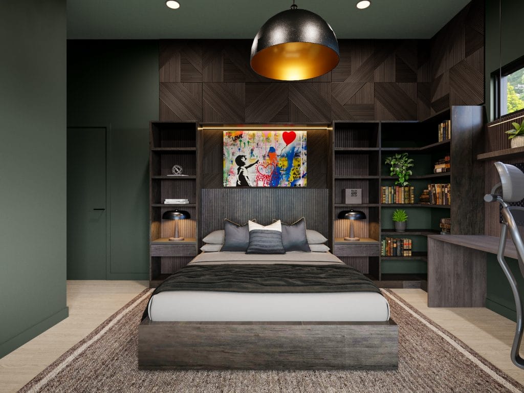
The bed wall integrates a platform queen frame—also requested—into a floor-to-ceiling storage system faced with geometric wood paneling. Flanking shelving units hold books within arm’s reach, which supports the young man’s reading habit. A vibrant street art piece in Banksy style mounts above the headboard, where integrated LED strips provide both task lighting and visual separation from the shelving modules.
The bronze-lined pendant centered over the bed reinforces the industrial vocabulary.
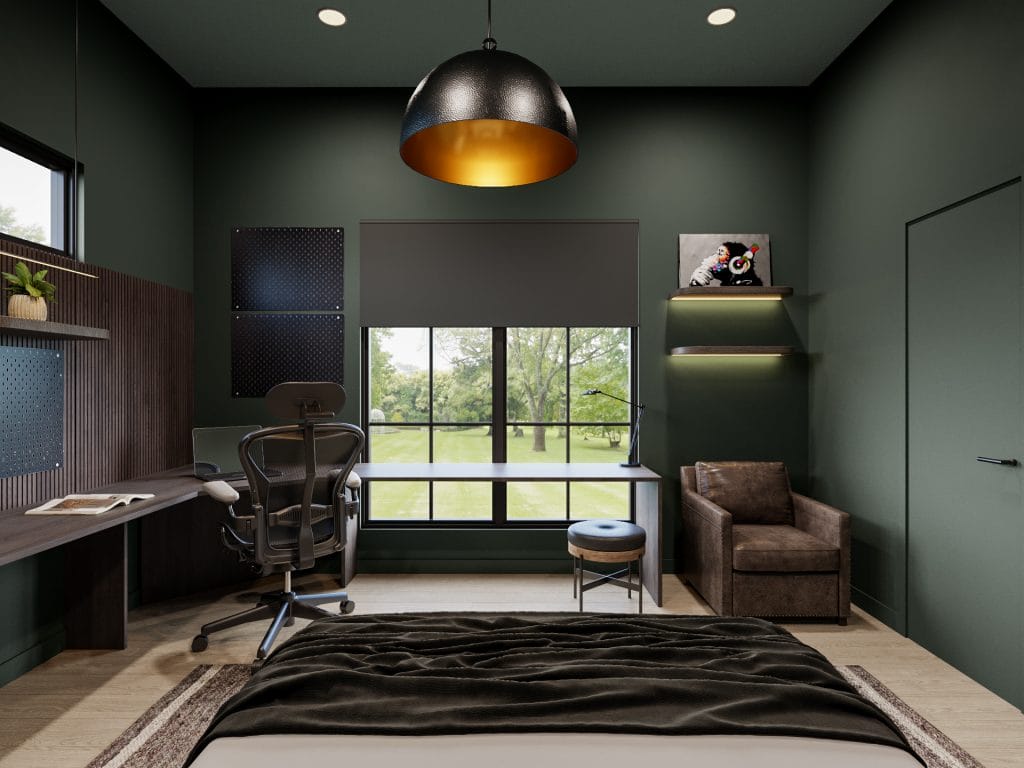
The wrap-around desk configuration occupies two walls and delivers the three distinct work zones outlined in the brief. One section accommodates written assignments with an open surface area. At the same time, the adjacent zone holds dual monitors and tower placement for gaming and computer science coursework. The third segment integrates a pegboard-backed surface where electronic equipment and soldering tools can remain permanently stationed. Charcoal work surfaces run continuously across zones, complete with an ergonomic task chair.
The reading nook materializes as a leather armchair positioned near the window wall where natural light reaches throughout the afternoon. A low upholstered ottoman extends the seating and doubles as a footrest during extended reading sessions.
Our Picks for the Look
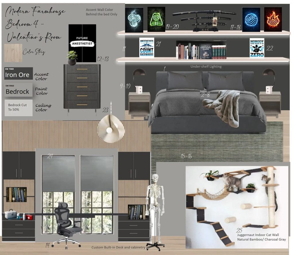
Teen Boy’s Bedroom
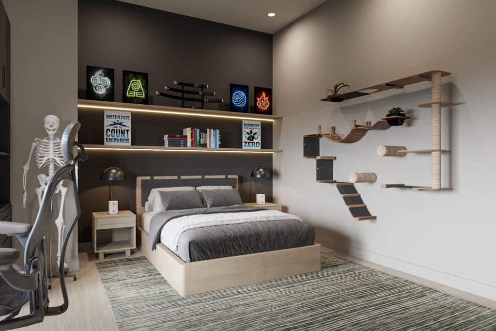
The third kid’s room design shifts the palette from saturated green to charcoal and taupe. The walls read as warm light gray in most lighting, with one accent panel in deeper charcoal behind the bed. This is where floating shelves distribute books and memorabilia across the horizontal span. Elemental symbol prints along the top shelf contribute color accents in blue, yellow, and orange against the neutral backdrop. An elaborate cat climbing structure occupies the wall adjacent to the bed.
The bed itself sits as a low platform in light wood. Its position allows clear sightlines to both the desk area and the door, and the striped area rug defines the sleep zone footprint.
Wood slat cladding wraps portions of the ceiling and upper walls. The retained flooring grounds the lighter palette, and the sculptural pendant fixtures provide ambient light distributed across functional zones.
Storage solutions appear throughout the bedroom in varied forms. A ribbed wood dresser with brass hardware sits opposite the bed; its textured front contrasts with the smooth painted walls.
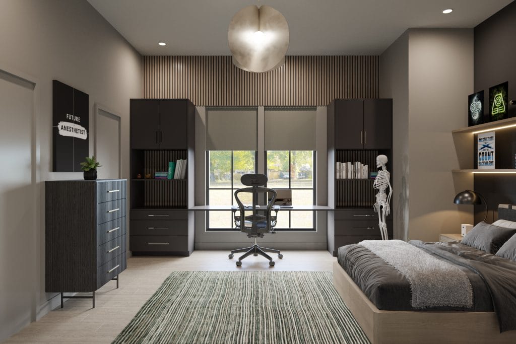
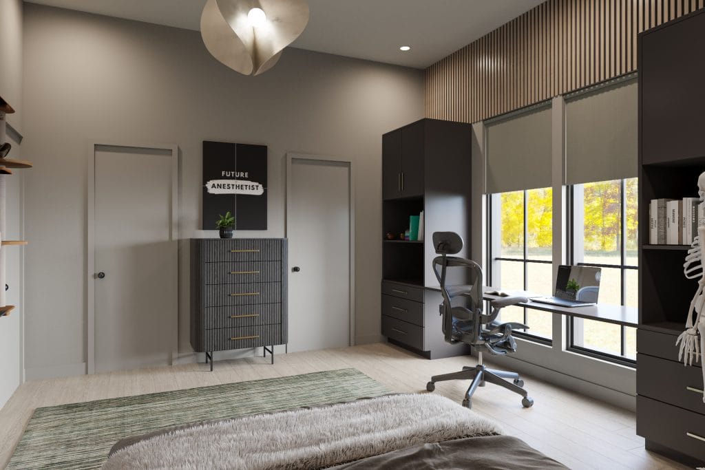
The desk occupies the room‘s window wall with charcoal storage towers flanking both sides. Each tower holds a combination of closed cabinetry above and drawer banks below, maximizing vertical storage where floor area remains limited. The work surface spans the full width between towers as an uninterrupted plane.
Black-framed windows behind the desk bring daylight directly onto work surfaces throughout morning and afternoon hours. An ergonomic mesh chair rolls freely across the span, and the desktop height allows standing work when extended sessions demand postural variation.
Our Picks for the Look
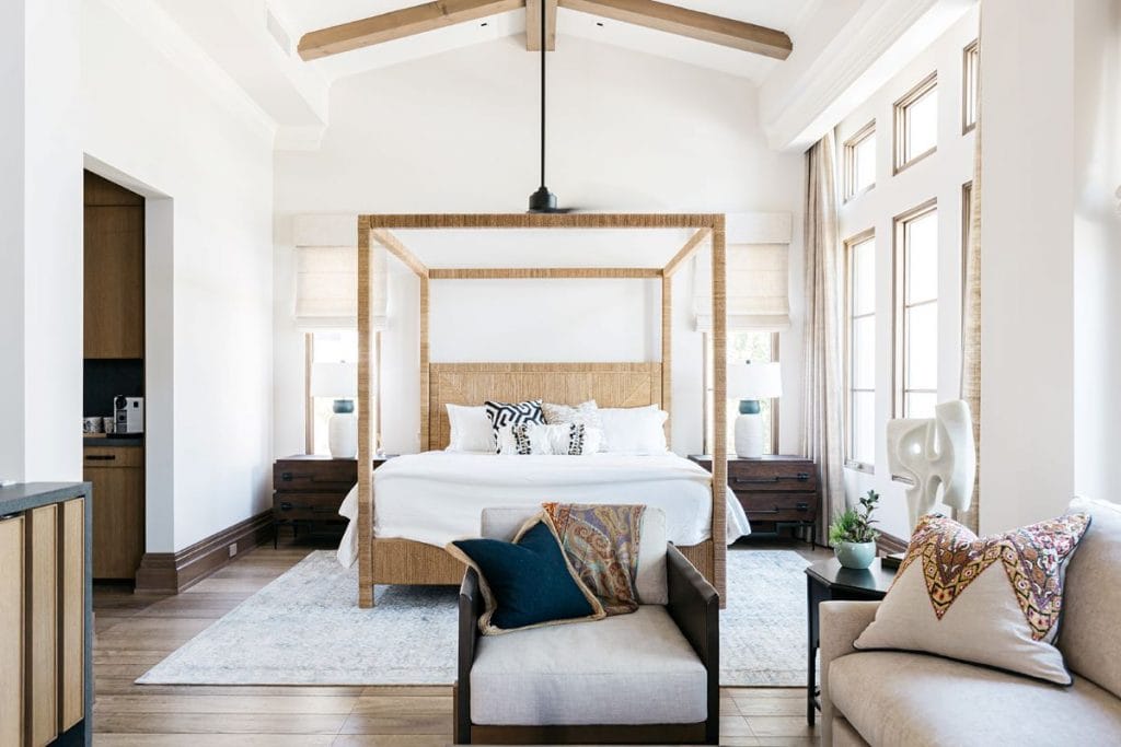
Guest Bedroom Design
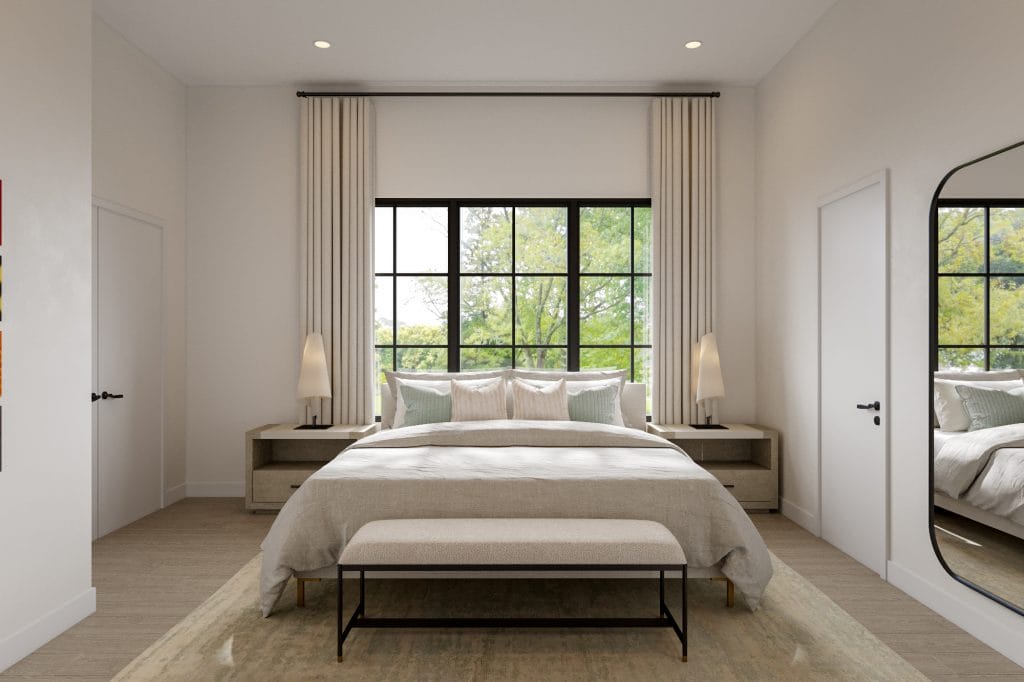
Wanda’s guest bedroom design establishes a neutral foundation with pale wood and white walls. Sage green accents distributed across pillow shams and throws interrupt layered beige textiles. A platform bed in light oak centers on the window wall, flanked by integrated nightstands that hold simple cone-shaped table lamps in cream ceramic. Black-framed windows bring the architectural language from other rooms in the house into this space, while floor-length curtains in natural linen soften their hard geometry.
A full-length arched mirror leans against the wall in black metal framing. Its curved top also softens the room’s predominantly rectilinear layout. The mirror reflects the bed and window wall, visually expanding the space and distributing natural light deeper into the room.
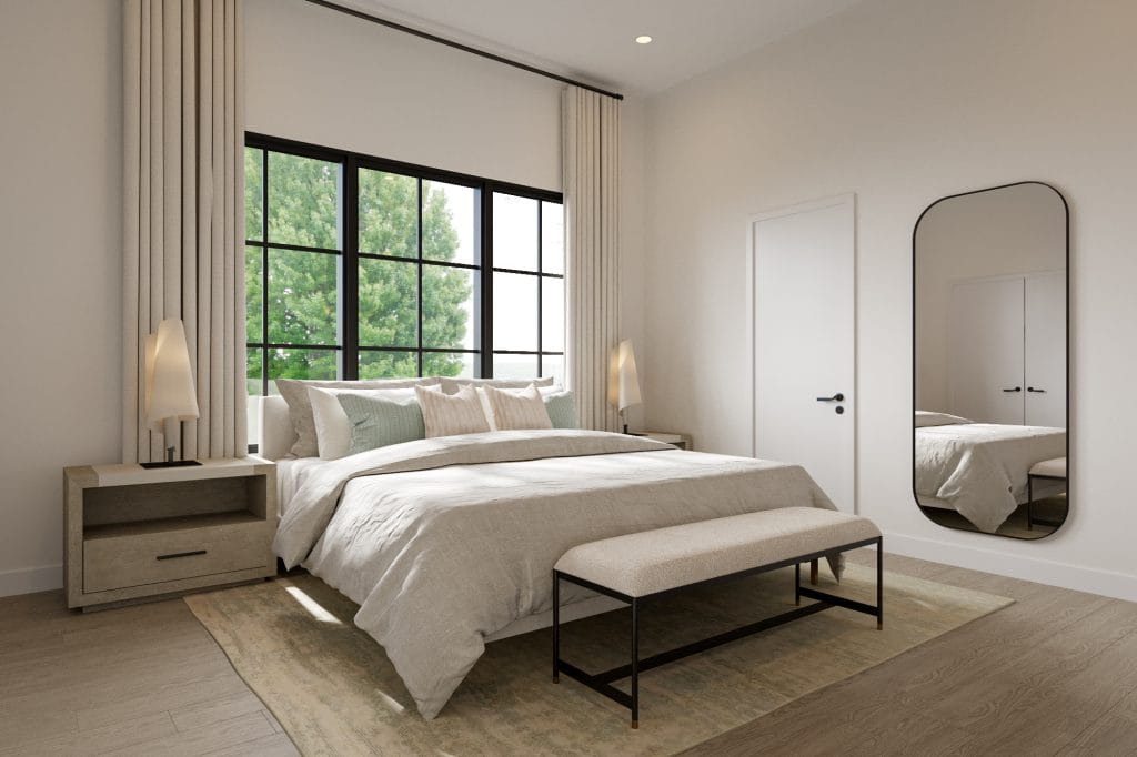
The bed itself sits low on a wood frame with single-drawer nightstands built into each side. Pillows layer in varying textures—white linen, striped beige, textured weave, and sage waffle-knit. The upholstered bench positioned at the bed’s end provides seating as well as luggage placement. Its black metal frame echoes the window muntins and establishes visual continuity across the room.
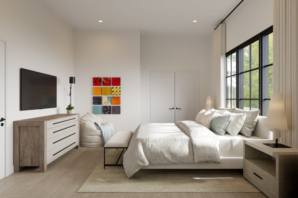
Storage appears along the wall opposite the bed. A mixed-material dresser combines light wood cabinetry with white drawer fronts and black pulls. Above it, a wall-mounted flat-screen television provides entertainment. A colorful grid artwork hangs above the bean bag, introducing red, yellow, orange, blue, and charcoal into the overall neutral scheme.
Our Picks for the Look
Jack and Jill Bathroom Design
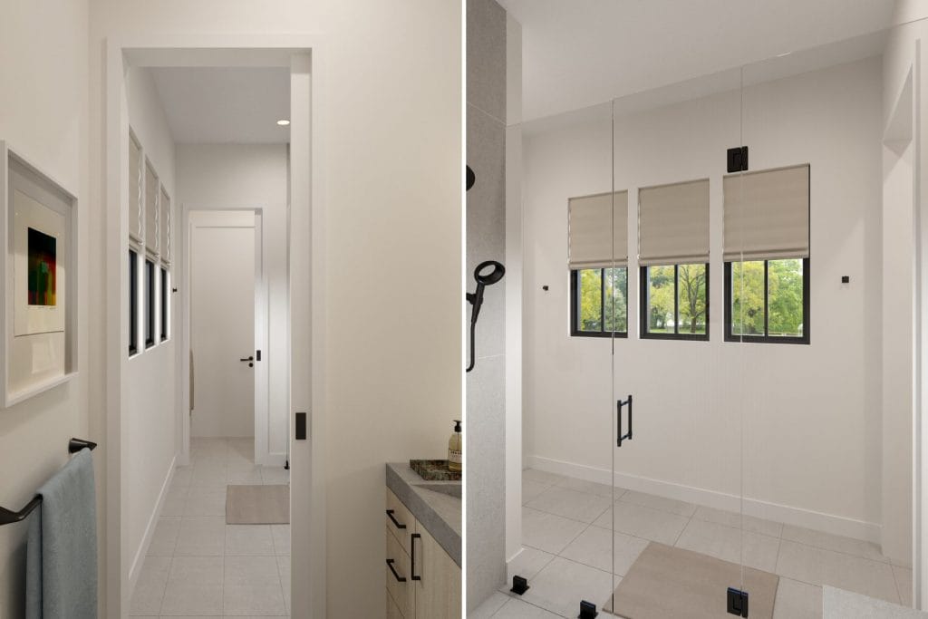
Wanda’s Jack and Jill bathroom design bridges the adjacent bedrooms through a compartmentalized layout that separates wet and dry zones. Large-format porcelain tiles in pale gray cover the floors throughout. The same material extends up the shower walls in horizontal installations that read as clean field surfaces.
White walls dominate the vanity and toilet areas, while the shower enclosure adheres to the gray tile palette. Black hardware and fixtures provide consistent accents across all functional zones.
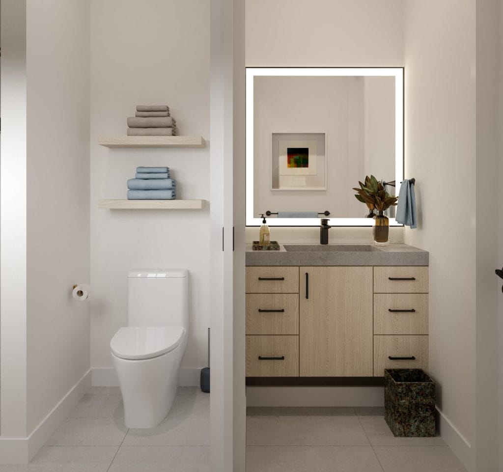
The vanity sits along one wall with a light oak cabinet below a thick concrete countertop. Six drawers in two columns flank a central door cabinet, and black bar pulls mark each drawer front. An integrated concrete sink basin sits flush with the counter surface, eliminating the raised rim typical of drop-in models.
The vanity’s open base creates a floating effect, and the toe kick allows for a close approach during daily routines. The backlit mirror mounts directly above the vanity in a black metal frame that echoes the window muntins. LED strips behind the mirror distribute even lighting across the reflection surface and illuminate the wall behind.
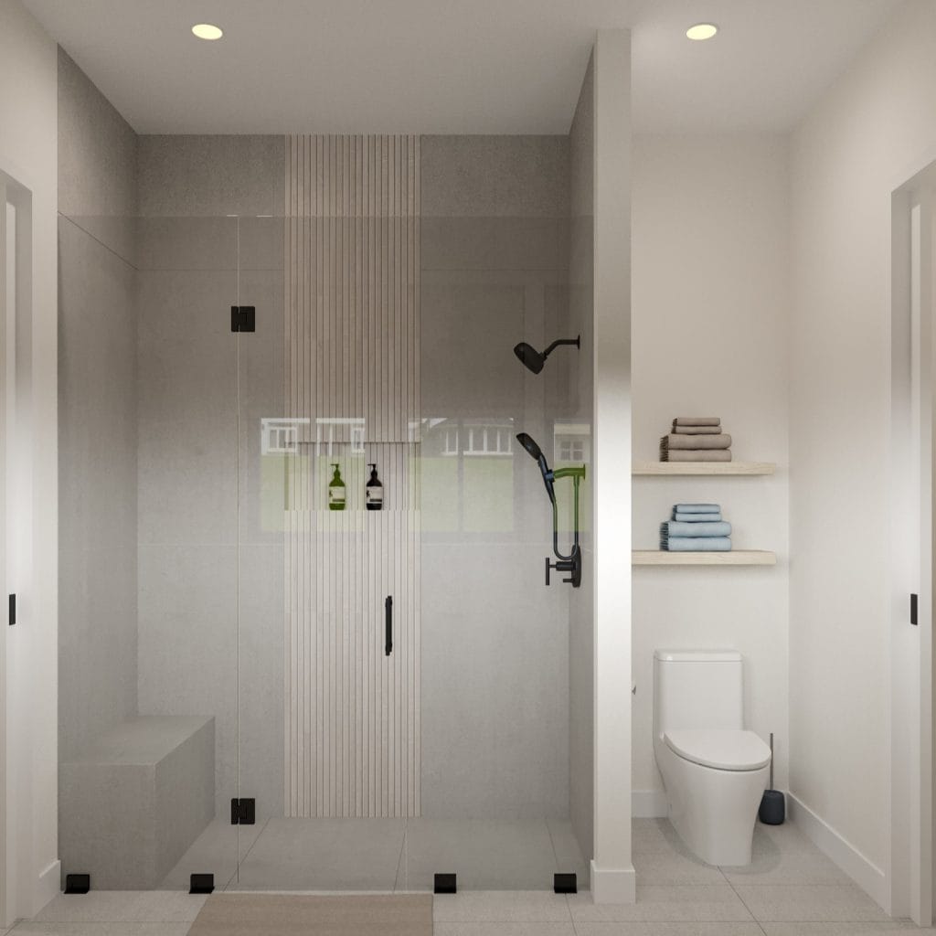
A vertical strip of narrow stacked tiles runs down one shower wall, introducing linear texture where the rest of the space maintains smooth planes. This shower enclosure spans a generous footprint with frameless glass panels anchored by black hardware at the floor and ceiling points. A fixed showerhead mounts to the wall, and a handheld spray attaches to a slide bar for adjustable height. Black fixtures preserve the hardware consistency established at the vanity and door hardware.
The toilet sits in a separate alcove visible through a doorway, maintaining privacy when multiple users occupy the bathroom simultaneously.
Design Details: Sourcing the Perfect Pieces

Decorilla’s 3D renderings gave the clients a way to evaluate finishes and furniture selections even from overseas. This was very important because without digital tools, material approvals would have cycled through international sample shipments and coordination calls spanning conflicting time zones. Moreover, exclusive vendor access through Decorilla brought furniture at below-standard retail rates, leaving more room in the budget for millwork upgrades and finish improvements.
Wanda adjusted specifications as construction progressed and priorities evolved. The remote collaboration stretched several months, with final furniture installation following the family’s summer relocation. At the end, the client’s note read: “Hi Wanda, I can’t believe we are at the end! It’s been such an amazing project.”
Looking for cool kids’ rooms design?
Interior designers balance current needs with future flexibility, and remote tools make it easy to collaborate from concept to installation—no matter where you are. Book your Free Online Interior Design Consultation to start your project today!


Comments