


So, which hues will dominate interiors in the next year? The colors of the year 2026 reveal a saturated palette that invites us to rethink how we use color in everyday spaces. From versatile neutrals to nature-inspired greens, here’s how to use these hues to refresh your home with confidence.
Sherwin-Williams Color of the Year 2026: Universal Khaki
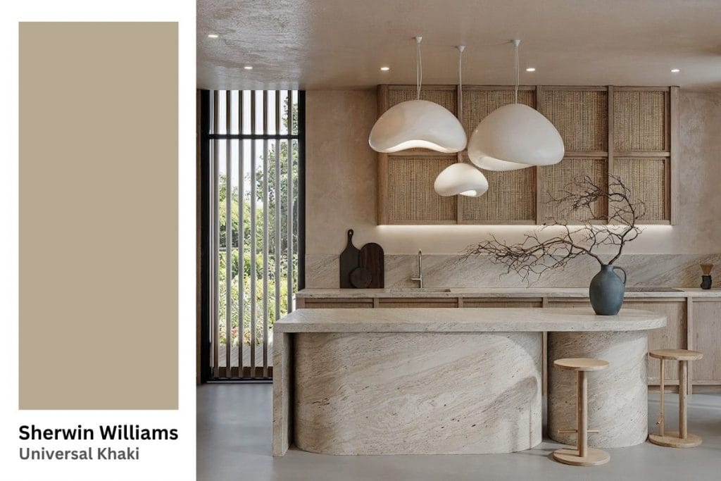
Sherwin-Williams picks Universal Khaki SW 6150 as the 2026 color of the year. It is a mid-tone neutral with a hint of yellow and green undertone. Designed to act as a foundation for a wide range of elegant design styles, Universal Khaki strikes a rare balance.
It is warm enough to feel inviting yet neutral enough to let furniture, textiles, and art command attention. It also sits right between greige and taupe, making it a reliable bridge between cool and warm color schemes. Although it announces a new trend, because of this versatility, Universal Khaki transitions effortlessly from modern minimalism to classic comfort. Just like its name says.
Pro Tip: Got your favorite 2026 colors picked, but unsure about the overall design direction? Try our Free Interior Design Style Quiz to discover your ideal style today!
Best Uses for Universal Khaki in Your Home
- Pair Universal Khaki with crisp whites or cooler greys to create visual contrast. Try soft grey linens, white oak floors, and brushed-nickel hardware for a timeless palette.
- Incorporate materials with varied tactile qualities to prevent monotony. Think woven throws, stone countertops, ceramic vases, or metallic fixtures. Mixing finishes and textures ensures this Sherwin-Williams color of the year 2026 will pop up in the space.
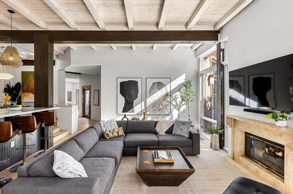
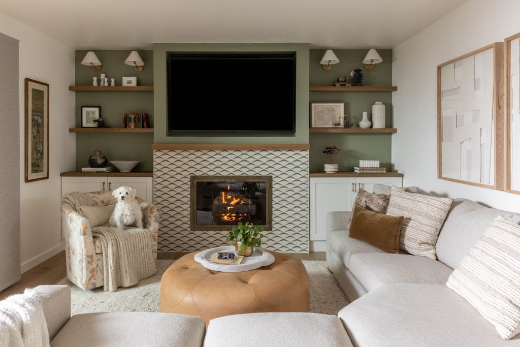
Calm Living Room Walls
Paint the main walls of your living room in Universal Khaki to create a warm, inviting foundation. For added depth, consider color capping the ceiling in a deeper tone to enhance the room’s atmosphere. This creates a relaxed, stunning backdrop that allows furniture and décor to shine. Add a textured rug, dark accent lighting, and some greenery to make the most of the scheme. The color’s subtle undertone makes it particularly forgiving under changing daylight, so the room looks cohesive throughout the day.
Subtle Kitchen Cabinetry with Lasting Appeal
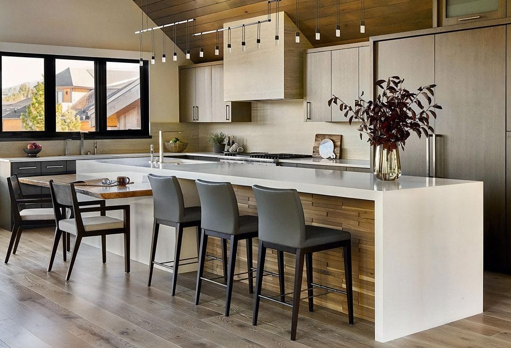
Consider applying Universal Khaki on lower or upper cabinets while keeping the other half lighter for contrast. This shade plays nicely with pale wood accents, black fixtures, or brass hardware, leaving the kitchen feeling grounded. A khaki island with quartz counters and white walls creates a smooth flow that looks intentional but never sterile.
Comforting Bedroom Accents
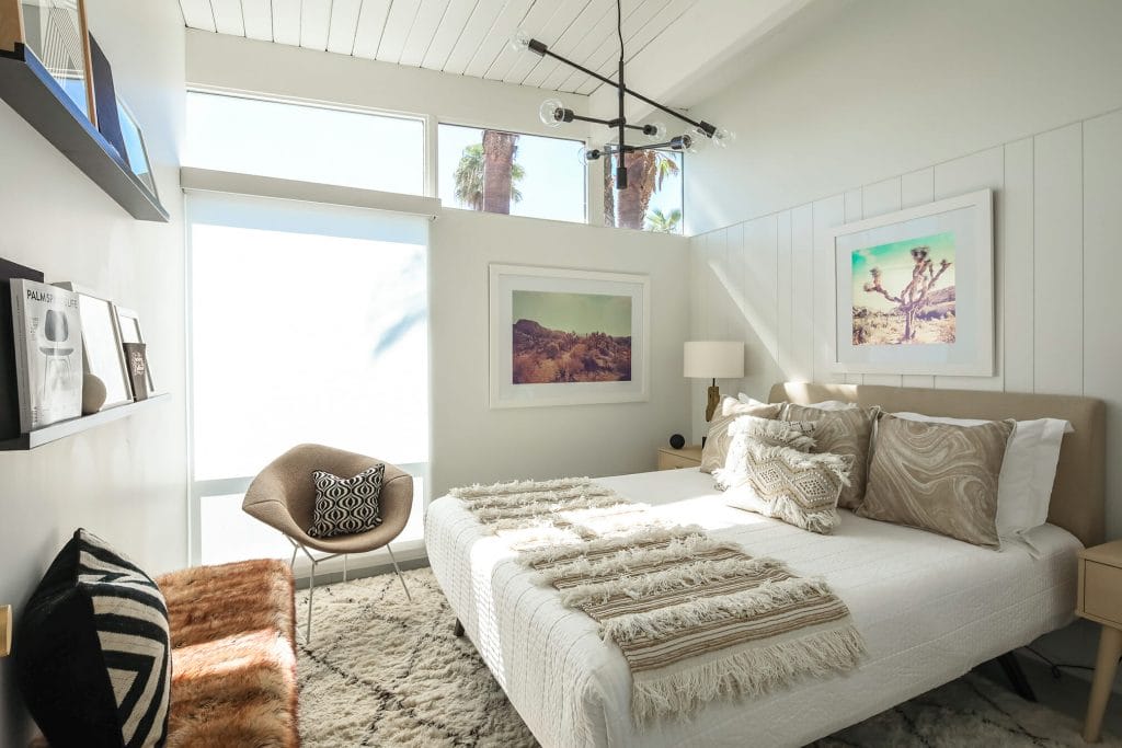
In a comforting bedroom, Sherwin-Williams Universal Khaki makes a perfect backdrop for cozy accents. This neutral hue complements soft linens and natural wood furniture. Incorporate it in your headboard, throw pillows, and textured blankets to create a warm, inviting space. Universal Khaki brings a relaxed, tranquil vibe that encourages rest, making it the ideal choice for creating a calming retreat.
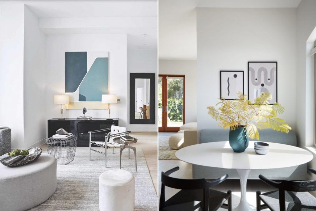
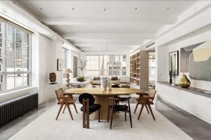
Designer Picks in Universal Khaki Color of the Year
Benjamin Moore Color of the Year 2026: Silhouette
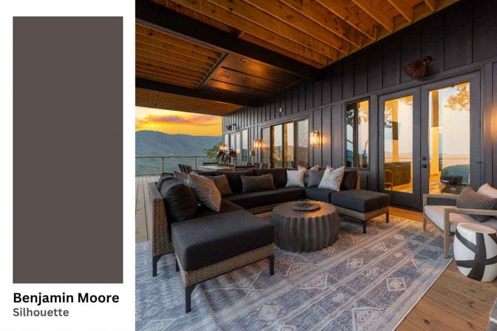
Benjamin Moore’s 2026 Color of the Year is Silhouette AF-655. It features a rich espresso-brown with subtle charcoal undertones, designed as a sophisticated alternative to black or deep grey. Moreover, Silhouette stands out in the color trends 2026 palette for its quiet luxury—this shade draws inspiration from tailored suiting and timeless craft.
Best Uses for Silhouette in Your Home
- Because Silhouette is darker, be sure to use adequate lighting and contrast when applying it broadly. Lighter furniture, warm metallic accents, soft neutrals, or high-gloss finishes help prevent the room from feeling too heavy.
- Silhouette has a refined tone that complements natural stone and textured fabrics. Balance it with linen, velvet, or woven shades to soften its formal edge.
Grounding Living Room Furniture
For a grounding effect in your living room, Benjamin Moore’s Silhouette works beautifully on oversized furniture. This deep, rich hue adds weight and presence to larger pieces, like sofas and armchairs, creating a sense of stability and balance in the space. The dark tone anchors the room, allowing lighter elements like rugs and accessories to stand out.
Elegant Built-In Brilliance
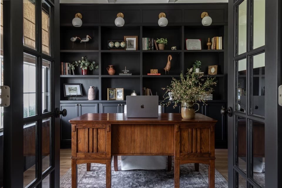
In a study or living area, paint built-ins and cabinetry in Silhouette. The dark backdrop will make books, art, and decorative objects pop. Pair this with lighter walls and wood accents to keep the furniture piece from visually disappearing into the wall. The contrast will also bring structure to the space, turning storage into a design feature.
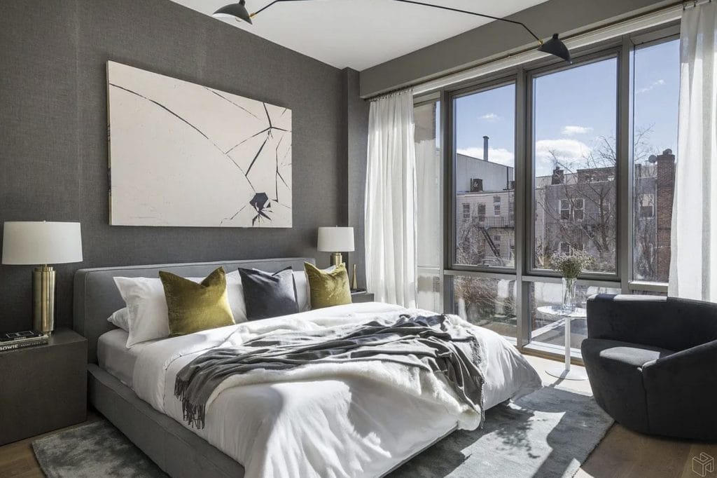
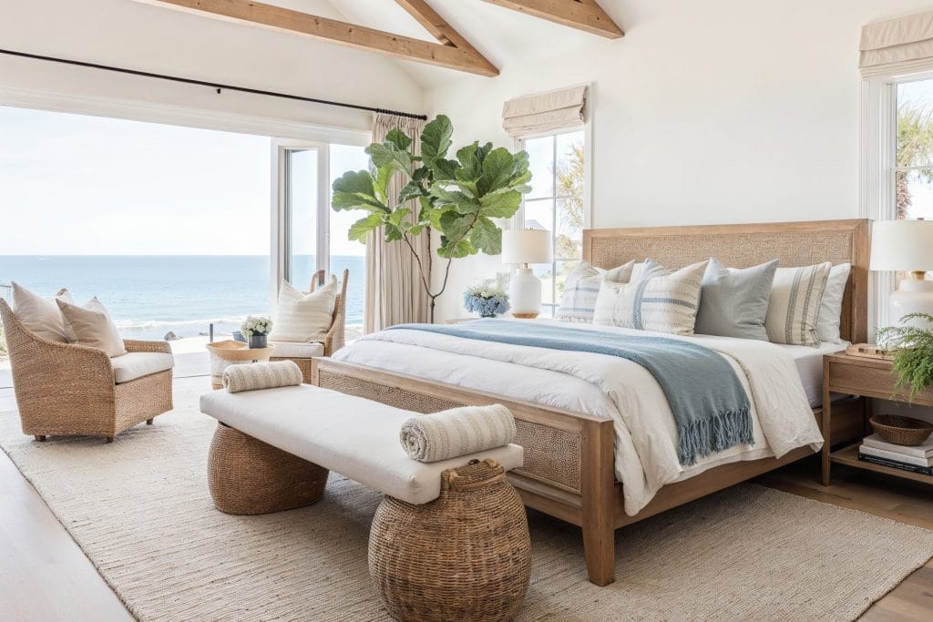
Beds with a Presence
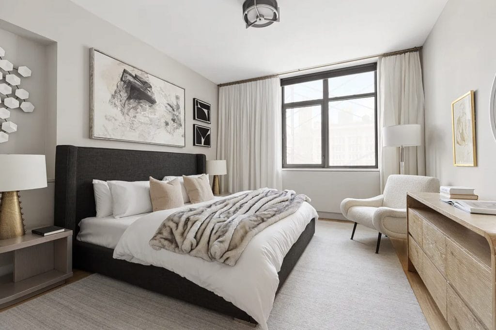
For a bold statement in the bedroom, choose a bed in a fabric that matches the deep, rich tone of Benjamin Moore’s Silhouette. This luxurious hue anchors the room, making the bed the focal point. The dark tone contrasts beautifully with lighter walls and soft linens, adding both depth and elegance to the space.
Designer Picks in Silhouette Color of the Year
Valspar Color of the Year 2026: Warm Eucalyptus
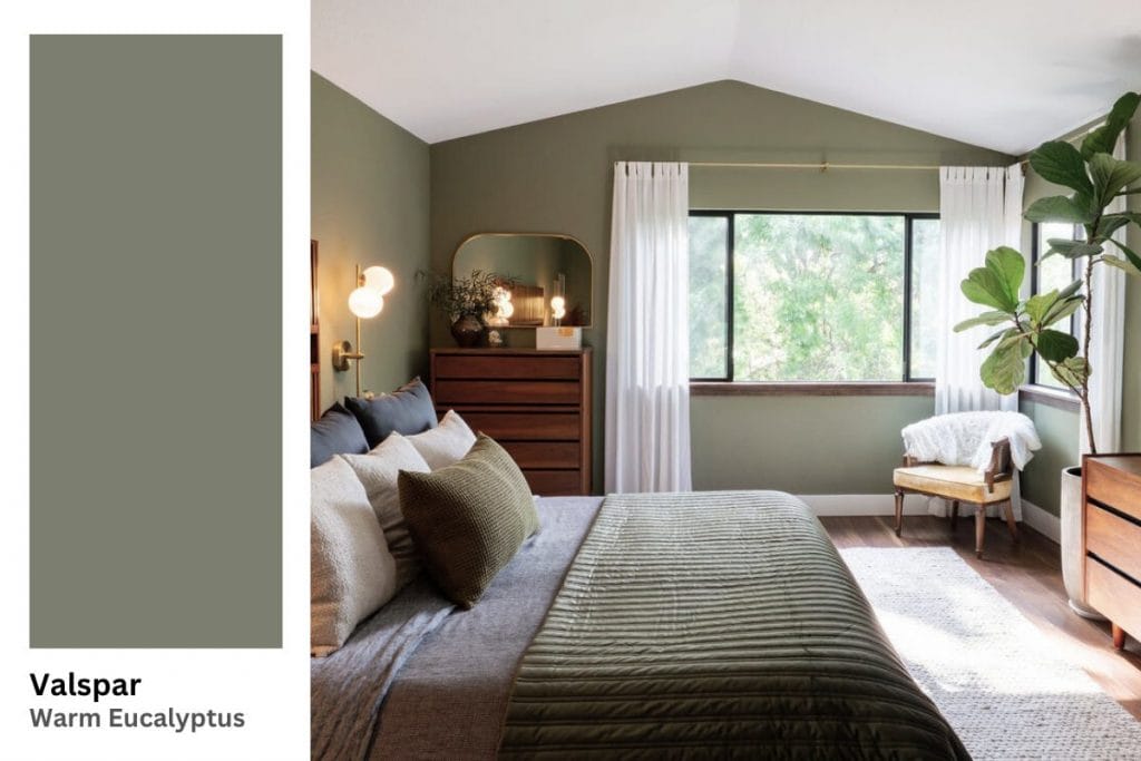
Valspar’s selection for the colors of the year 2026 is Warm Eucalyptus 8004-28F. It is a green hue with warm undertones, inspired by nature and vintage palettes. A modern nod to retro sage greens, this shade is now updated with a richer tone. It connects to the growing preference for organic design, earthy palettes, imperfect textures, and calming, colorful interior design.
Best Uses for Warm Eucalyptus, the 2026 Color of the Year, in Your Home
- Warm Eucalyptus bridges indoor and outdoor living beautifully, pairing with natural materials such as jute rugs, rattan, cane, or reclaimed wood.
- Blend this paint color of the year 2026 with cream or sand tones that allow the color to breathe. To modernize the look, mix in metallic or tan leather finishes.
Serene Laundry Accent Walls
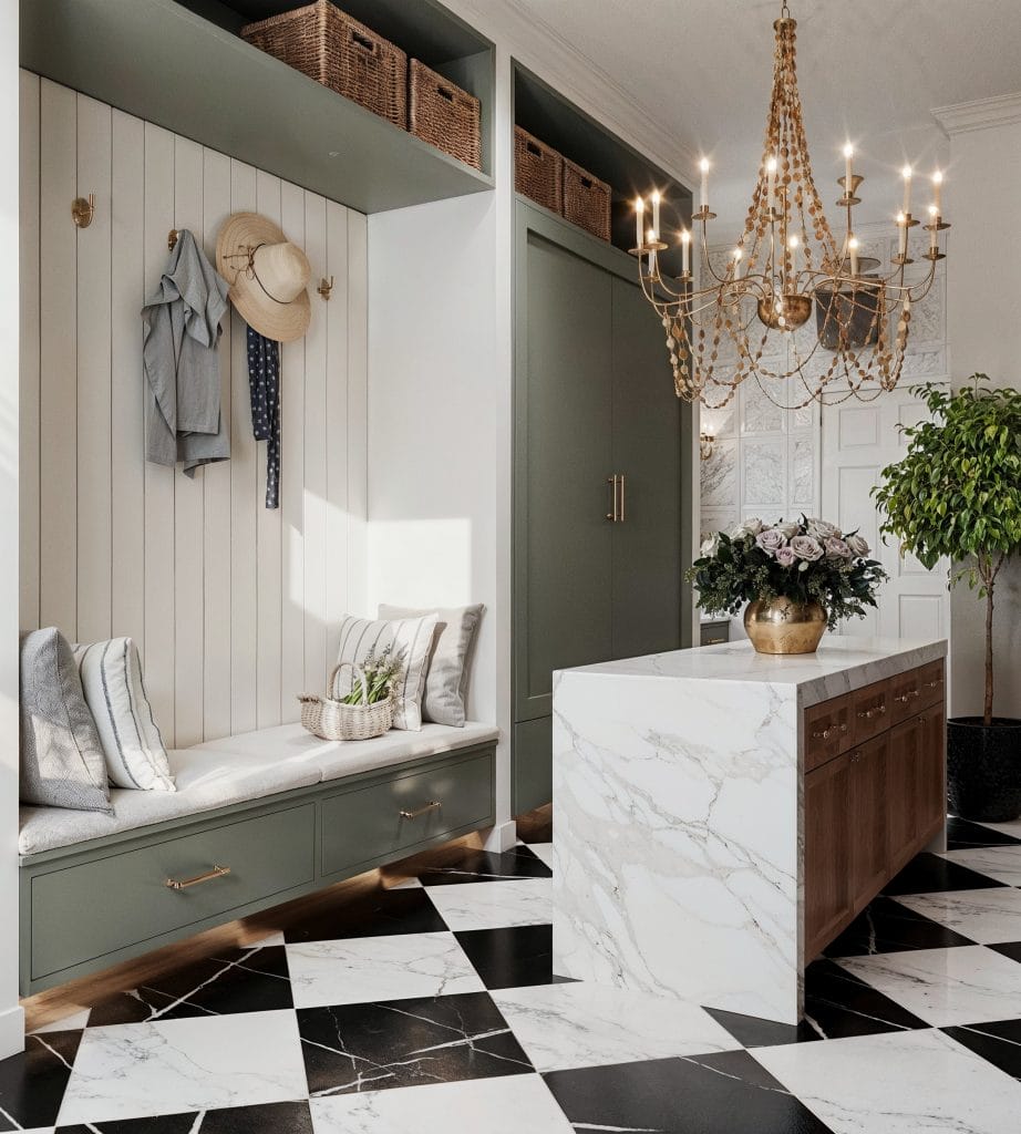
In a mudroom or entryway, use Warm Eucalyptus on the walls, cabinets, or as a tile accent. Pair with crisp white fixtures, matte black or brushed gold hardware, and plants for an organic feel. The color gives the space a calm, natural mood without leaning ultra-cool. Use warm diffused lighting to emphasize the subtle golden undertone in the green.
Nature-Inspired Bedroom
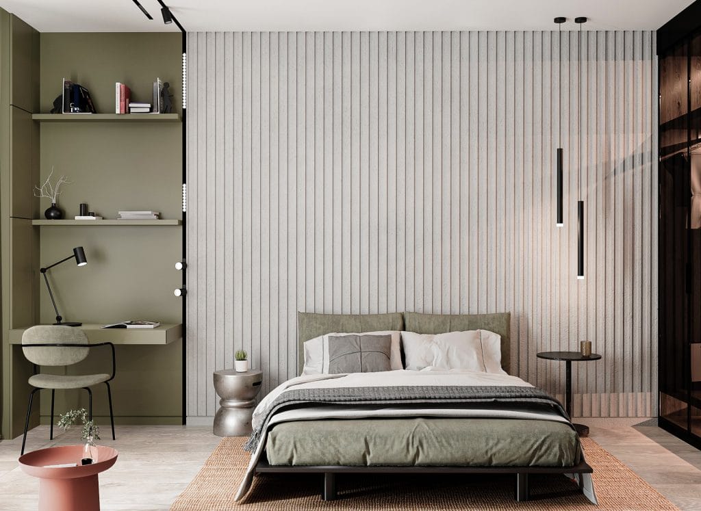
For the bedroom, use Valspar’s Warm Eucalyptus on an accent wall or in bedding to introduce a soothing, nature-inspired vibe. This serene tone creates a genuinely peaceful retreat. The soft green adds tranquility and warmth, pairing beautifully with neutral furniture and light wood accents.
Statement Two-tone Kitchens
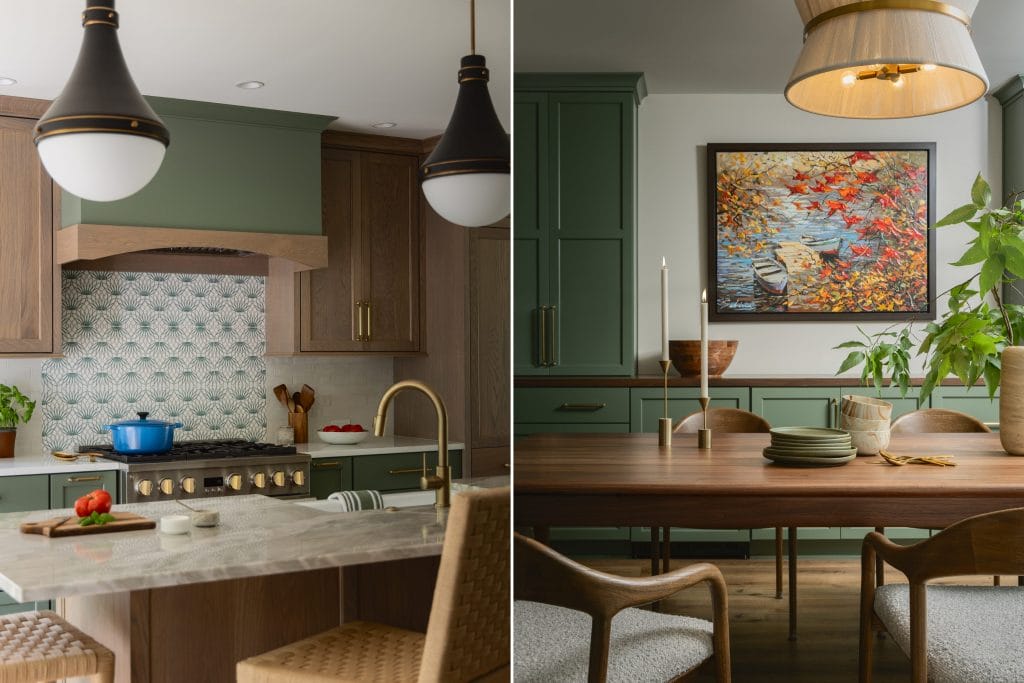
For a stunning two-tone kitchen, use Warm Eucalyptus on the lower cabinets or range hood, paired with lighter neutral or wood-finish upper cabinetry. The rich green adds depth and character to the space, acting as a grounding element. Complement the design with brass hardware or wooden countertops for a timeless, well-balanced look.
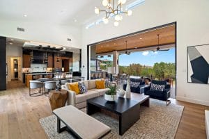
Designer Picks in Warm Eucalyptus Color of the Year
Behr Color of the Year 2026: Hidden Gem
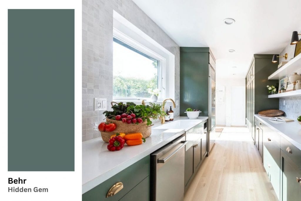
Behr’s 2026 color of the year is Hidden Gem (N430-6A), a smoky jade tone that blends blue and green into a new neutral. It has a sophisticated flair, and feels fresh without seeming cold. It is one of the more flexible blue-greens since the popular Evergreen Fog color, another Sherwin-Williams favorite that started this soft-nature trend.
Best Uses for Hidden Gem in Your Home
- Use Hidden Gem in smaller doses if you are new to bold colors. Add it to furniture, doors, or shelving before scaling to larger surfaces. Its muted sophistication means it can work as a base or as an accent.
- This color of the year feels exceptionally chic when paired with warm whites, soft beige, wood, brass, or even terracotta tones.
Unexpected Wall Detail
Instead of painting all walls, use Hidden Gem halfway up or in mouldings and trims to give the room a designer touch. Keep the upper walls and ceiling in a lighter tone to maintain balance. Bring in a few accessories that repeat the hue so the palette feels intentional. The contrast between the lighter surfaces and the smoky jade tone subtly pulls the eye upward, which makes the ceiling feel taller.
Soothing Tile Color
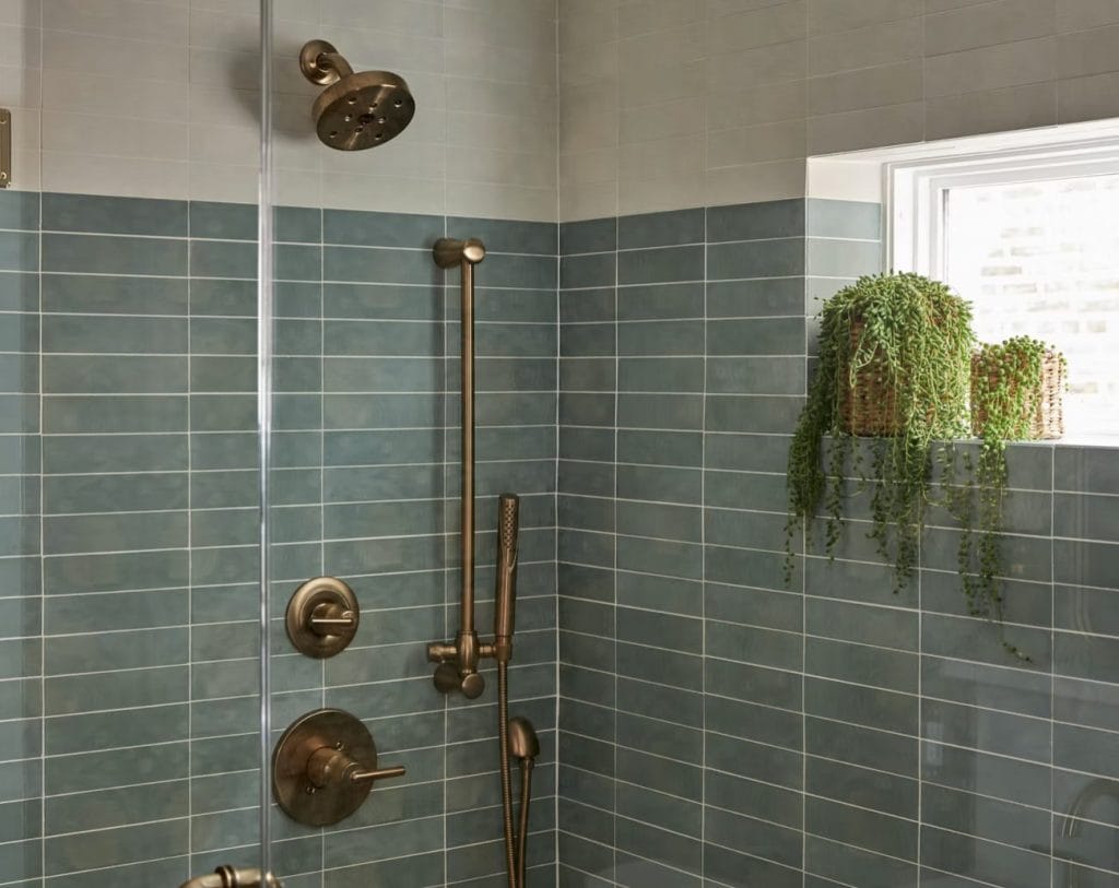
Tiles in a hue similar to Behr’s Hidden Gem bring a rich, calming aura to your bathroom. The soft green adds sophistication, effortlessly pairing with brushed fixtures for a sleek, modern look. Add a few plants to enhance the natural vibe, creating a tranquil, spa-like atmosphere.
A Cool, Refreshing Pop
Use Hidden Gem for home accents like art and decor to introduce a sense of tranquility with style. This color adds an effortless, serene touch to your space, whether through wall art, cushions, or vases.
Designer Picks in Hidden Gem Color of the Year
Pantone Color of the Year 2026: Cloud Dancer
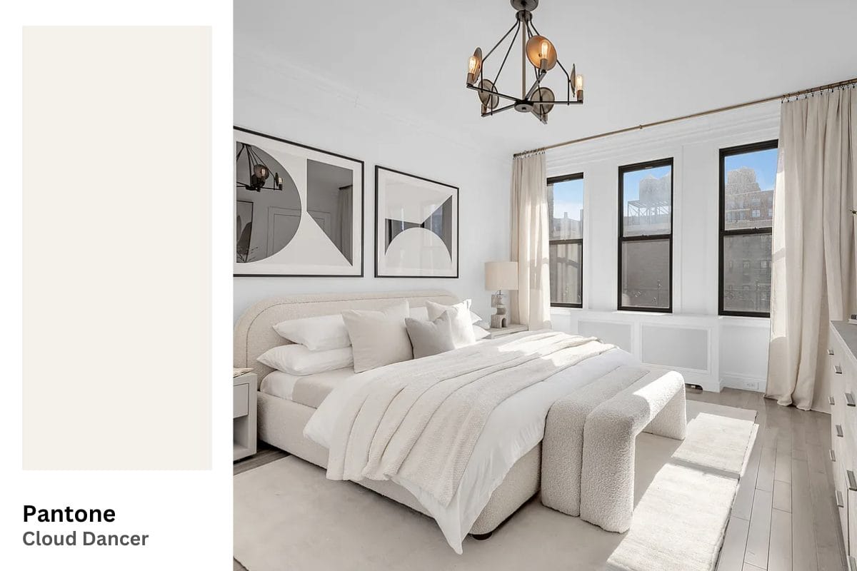
Pantone joined the Colors of the Year 2026 election with Cloud Dancer (PANTONE 11-4201). This is the first time Pantone has chosen a shade of white since the program began in 1999. The company describes it as “a serene white shade” and “a billowy, balanced white imbued with a feeling of serenity.”
According to Pantone’s executive director, Cloud Dancer is “associated with new beginnings” and “signifies our desire for a fresh start,” serving as “a calming influence in a frenetic society, rediscovering the value of measured consideration and quiet reflection.”
Best Uses for Cloud Dancer in Your Home
- Cloud Dancer is excellent for foundational surfaces, where it supports layered materials.
- This shade works better than white in light-filled rooms. Its balanced undertones adapt to changing natural light throughout the day.
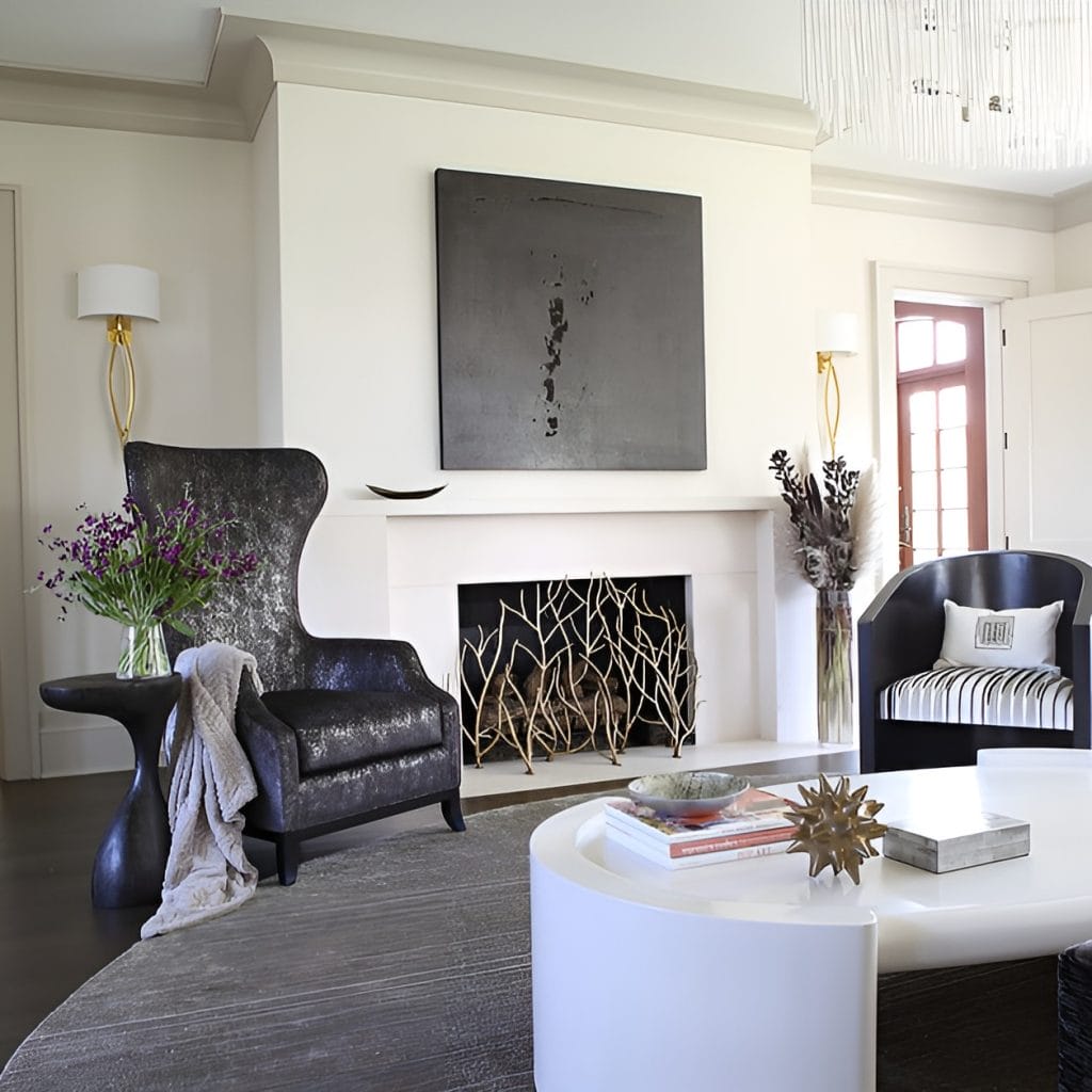
Fabric Weight and Spatial Anchoring
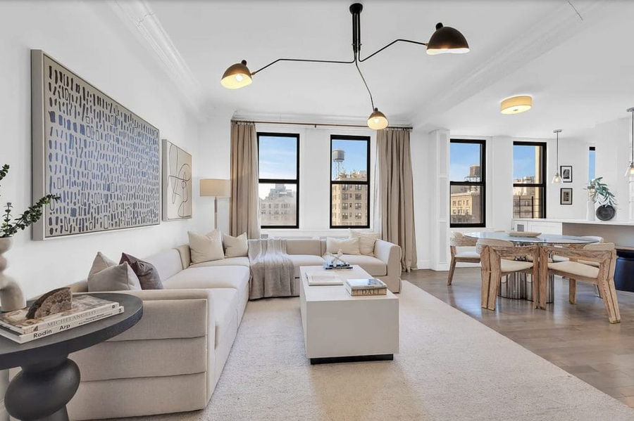
Cloud Dancer works well across seating profiles and textile weights. Use it in sectionals and curved swivel chairs, where the pale surface reads against darker floors or area rugs. Upholstered pieces in this shade anchor rooms with high natural light. The color also registers differently depending on fabric texture—smooth performance fabrics reflect more light, while textured weaves like bouclé or canvas absorb it, creating subtle depth.
Kitchen Cabinetry as Neutral Infrastructure
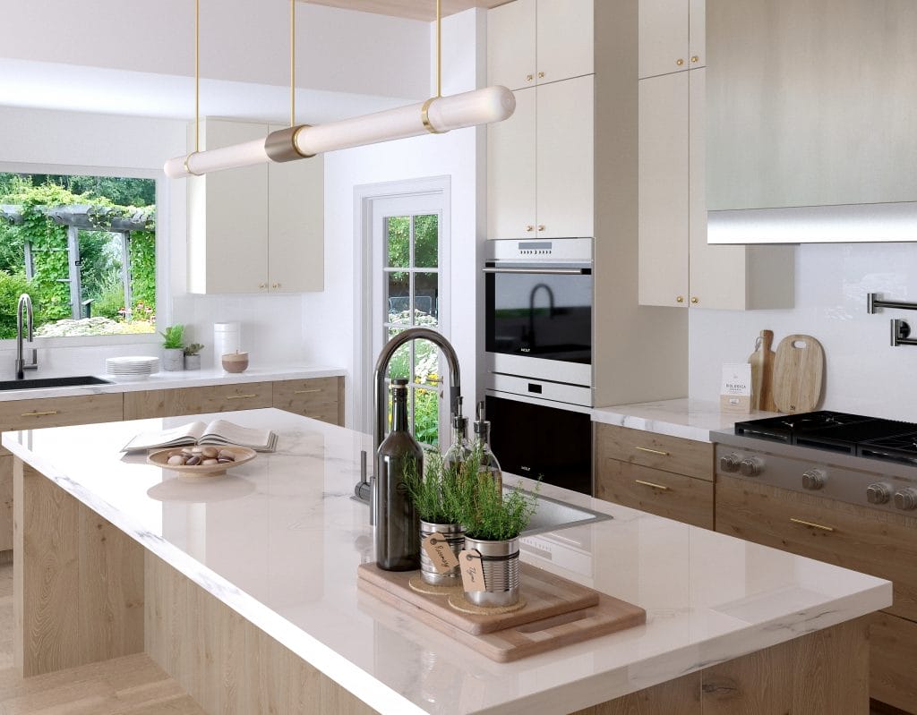
Kitchen cabinetry in Cloud Dancer establishes a neutral backdrop that accommodates varied countertop materials and hardware finishes. Use it on upper and lower cabinets in a soft white to create a continuous surface area that recedes behind functional elements. This approach works particularly nicely in kitchens with natural wood base cabinets or islands.
Framing Architecture and Furnishings
Cloud Dancer on walls creates a flexible foundation for layering materials and finishes. In spaces with architectural details like crown molding or wainscoting, the shade emphasizes these elements without introducing color contrast. The soft white appears warmer in morning sun and cooler in afternoon shade, which makes it practical for rooms with varying exposure throughout the day.
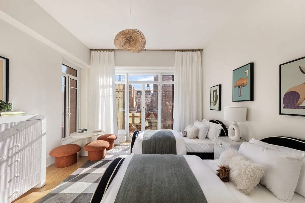
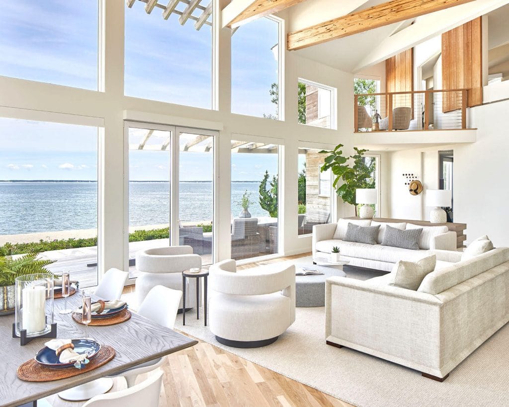
Designer Picks in Cloud Dancer Color of the Year
Ready to Incorporate These Colors of the Year 2026 into Your Space?
Let a pro help you choose the perfect palette and design a space that truly stands out. Book your Free Online Interior Design Consultation to start your project today!

Comments