


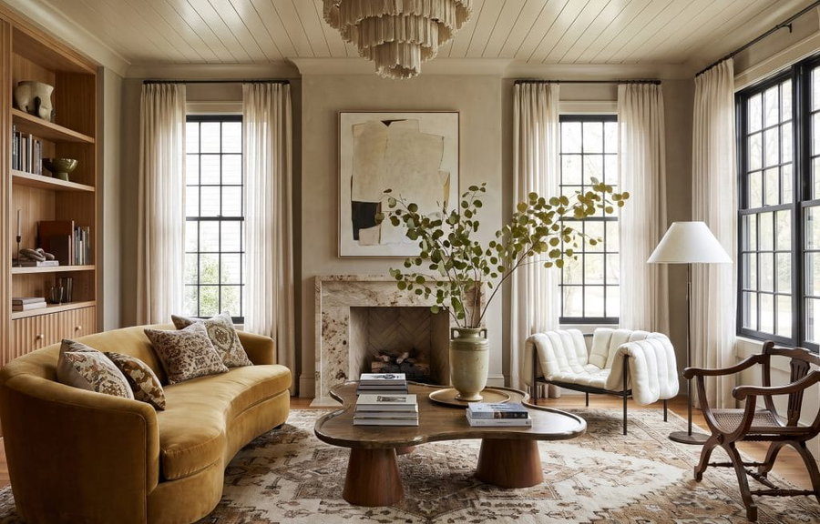
Greige interiors are often described as a midpoint between gray and beige, but that definition only gets you as far as the paint aisle. In a finished room, greige is more useful than that. It can quiet a busy material palette, pull different wood tones into the same composition, or give pale upholstery enough depth to stand away from the walls.
The choice becomes more personal once you consider what’s staying in each room. Your existing flooring might steer the palette toward beige, while an adjoining space calls for a grayer shade. Here’s how to work through those decisions room by room, with ideas for taking greige beyond the walls.
What Are Greige Colors?
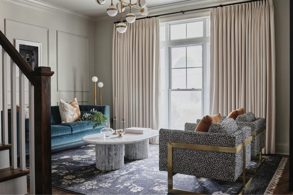
Greige colors combine gray and beige, though the ratio varies considerably from one shade to another. Some sit close to taupe; others look almost gray until late-day light pulls the beige forward. What matters more than the name on the card is undertone.
Warm greige usually carries a faint yellow or red cast, while cooler versions can move toward green or blue. The easiest way to spot that shift is to compare a large sample against something already fixed in the room, such as the flooring or countertop. Once you isolate the sample from neighboring paint chips, its undertone becomes much easier to see.
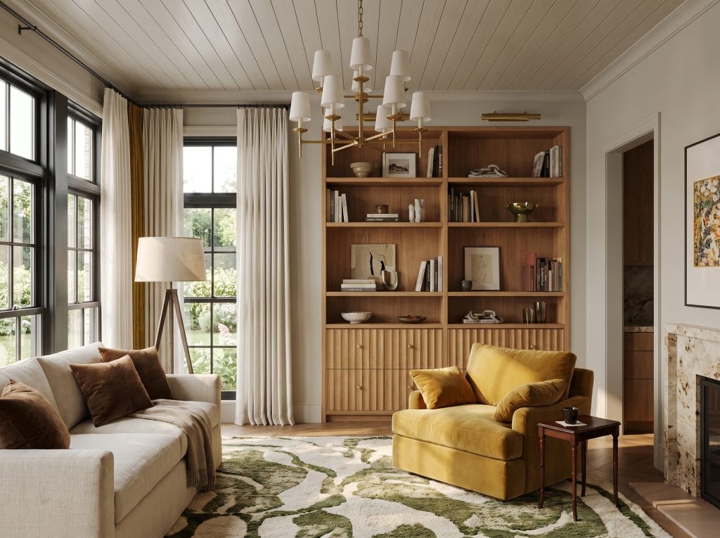
Sherwin-Williams Agreeable Gray SW 7029 is one of the better-known examples because it sits comfortably between the two color families. Accessible Beige SW 7036 moves warmer still, making it useful where the greige interiors already contain soft ivory or sandy tones.
Benjamin Moore offers a different range. Revere Pewter HC-172 carries more visual weight and can hold its own in larger rooms, while Edgecomb Gray HC-173 is lighter and often works well in spaces with strong daylight.
Then there is Elephant’s Breath by Farrow & Ball, which can shift cooler depending on the room’s orientation. In a formal setting, that slightly muted quality works well with darker timber and stone.
What greige does particularly well is mediate. Beige can become noticeably yellow beside crisp white trim. Gray may turn flat in a room with limited natural light. A well-chosen greige can absorb both conditions and still sit comfortably with the materials already in place. – Joyce H., lead Decorilla designer
Why Greige Works in Any Interior
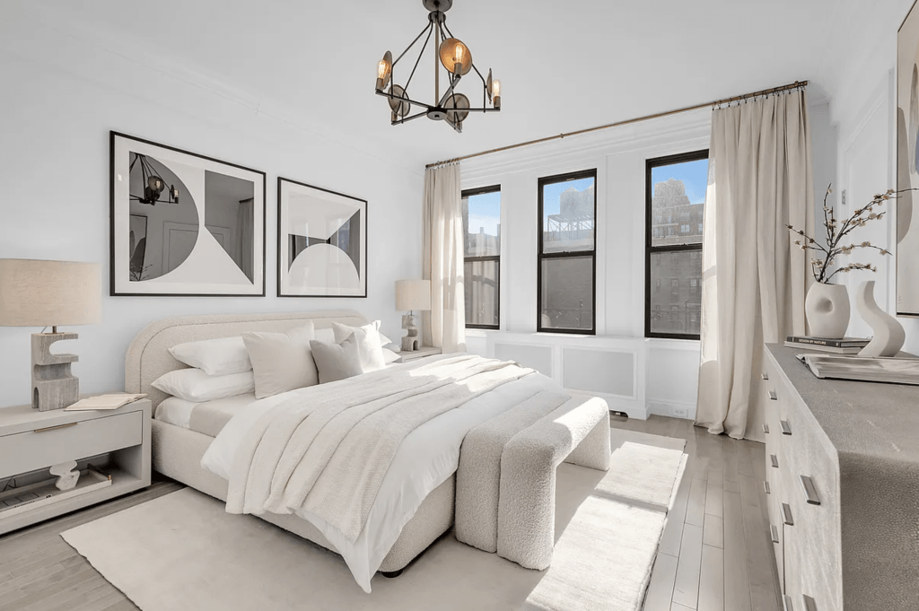
Most rooms contain more than one color temperature, even when the palette looks neutral at first glance. Oak brings a golden note, for instance, while walnut introduces something deeper. Marble pulls cool against warmer upholstery. Because of its dual nature, greige easily keeps those transitions from feeling disconnected. Plus it lets you shift the value while keeping the undertone consistent.
That flexibility is one reason it appears so often in neutral interior design. The same wall color can sit behind brass in one room and chrome in another, yet the overall palette still feels related. It also gives darker details more definition. Black window frames get more definition against greige than against a harder white.
Open-plan homes benefit from this especially. Light changes from one zone to the next, and a single neutral often needs to survive all of it without making the transition feel abrupt.
Which decorating style would you bring to greige interiors? Take Decorilla’s free interior design style quiz before choosing a direction for the room.
Greige Living Room
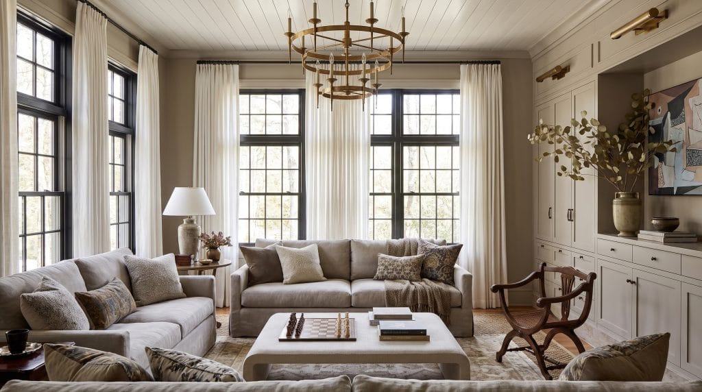
Whichever interior design style you choose, decide first what you want the greige to do. If the room already has warm oak flooring, creamy stone, or plenty of natural light, Agreeable Gray SW 7029 can sit quietly in the background. It will still give pale furniture enough definition. Revere Pewter HC-172 has more weight, which makes it useful in larger rooms where a very light wall color could leave the furnishings looking adrift.
Once the walls are settled, it’s important to consider the furniture in relation to them. A greige sofa that lands almost exactly on the wall color can disappear unless the fabric has strong texture, for example. Linen keeps the room relaxed because its weave catches light gently, while velvet creates more tonal movement and suits a more formal scheme.
This is also the point where accent color should enter greige interiors. Let it come from something substantial first, perhaps a sage chair near the window or artwork with a dusty rose note. Then echo it sparingly elsewhere to give the room a clear direction.
The rug and coffee table can correct whatever the room still lacks. If everything feels soft, use a low-contrast wool pattern to give the floor more structure. If the seating already has a tailored feel, a rougher surface such as jute can loosen the composition. Timber helps in much the same way: walnut deepens a pale greige scheme, while oak keeps it lighter and more open.
Greige Bedroom
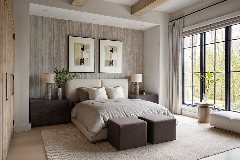
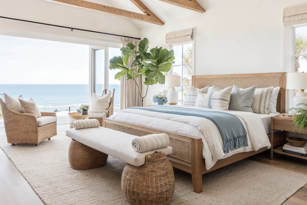
The bedroom allows greige to feel more enveloping. If the room has decent daylight, take one greige around all four walls. That will create a stronger sense of enclosure and also make the bed feel more settled in the layout. A darker wall behind the headboard can work too, especially in a smaller room where you want one clear focal plane. But it should feel connected to the rest of the palette.
Your bed is an excellent place to create (changeable) variation. Warm white or cream bedding gives the greige enough divergence, even if you opt for all texture and no pattern. A smoother cotton sheet against washed linen, for instance, already creates visible depth before you add another color. The headboard can also stay close to the wall tone if the fabric gives it enough presence. Natural wood nightstands, meanwhile, interrupt the upholstered zone and give the bed a firmer edge.
Curtains should support that same balance. In darker greige bedroom interiors, pale linen keeps the perimeter from becoming heavy. Hung close to the ceiling and taken to the floor, it stretches the wall visually, which often does more for a compact bedroom than another decorative layer.
Greige Kitchen
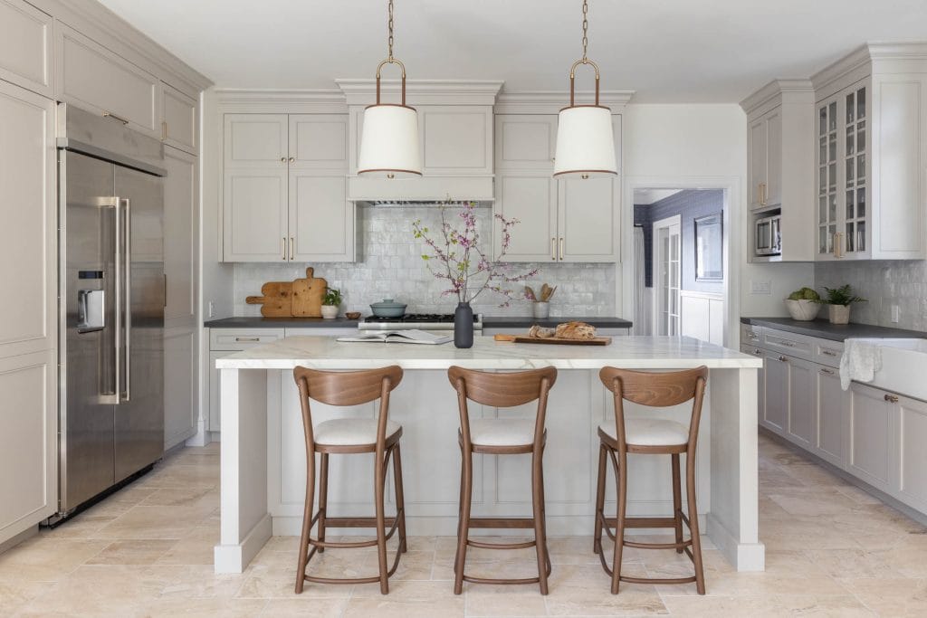
Greige performs especially well in a kitchen when the cabinetry needs to connect several existing finishes at once. White counters, warm flooring, stainless steel, and timber can pull in different directions, and a balanced greige cabinet color often becomes the point where those materials meet.
On shaker cabinetry, the color gains more depth because the profile catches shadow throughout the day. That makes greige feel less flat than it might on a large painted wall. The countertop then decides where the scheme goes next. If you are still comparing cabinetry and surface combinations, Decorilla’s guide to neutral kitchen colors gives you a useful wider palette to work from.
As for hardware, unlacquered brass pulls the warmer side of greige forward, particularly when the room already contains oak or creamy stone. Matte black has more graphic weight, so it works well where the greige kitchen interiors include dark-framed windows or accents.
The backsplash is where you should be especially careful with undertone. A warm white tile can merge almost seamlessly with greige cabinetry, while a cooler white makes the cabinets look warmer by comparison. Neither is automatically better; the important thing is that the shift looks deliberate once the whole wall is seen together.
Greige Bathroom
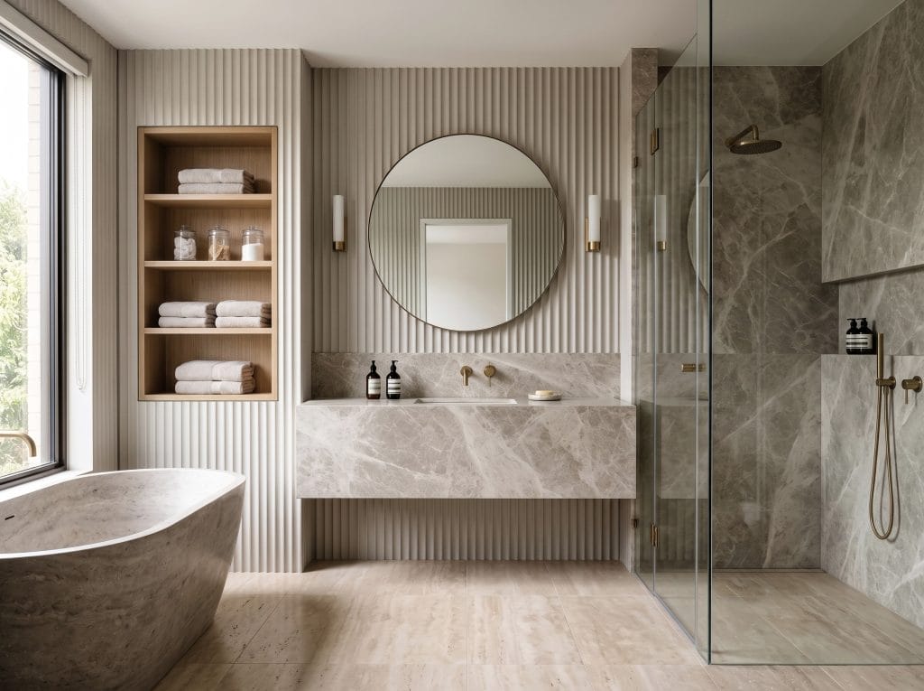
Bathrooms reveal mistakes in neutral palettes quickly because every finish sits within a few feet of the next. A greige that looked balanced on the paint card may suddenly show pink, green, or yellow beside the tile, so choose the largest fixed surface first and build outward from there.
If greige porcelain is doing most of the visual work, keeping the grout close in tone creates a quieter, more continuous background. In a bathroom with plenty of natural light, you can reverse that relationship and use greige on the vanity or walls while the tile stays lighter. The vanity is also a good place to introduce a slightly deeper version of the palette.
The metal finish of the fixtures should follow the undertone you are already seeing in the room. Brushed brass usually sits comfortably with warmer greiges, while polished chrome can sharpen a cooler scheme.
Greige Home Office
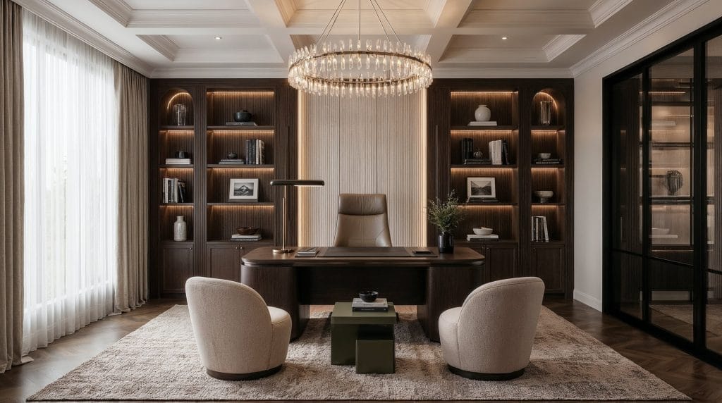
In a home office, greige works best when it gives the workspace enough definition and no visual distraction. That is particularly useful if the wall behind the desk also appears on video calls, where bright white can feel harsh and darker colors can dominate the frame.
A medium greige backdrop gives you more room to play with the desk finish. Pale wood or warm white keeps the work surface distinct, while darker timber makes sense in a brighter room where the walls and floor are already light.
A shaded task lamp brings a warmer pool of light to the desk once daylight drops. That small shift matters on camera too, because lighting temperature can push greige interiors toward gray and make the whole room feel flatter than it does in person.
If your greige scheme has reached the point where every sample looks almost right, Decorilla’s online interior design services can help coordinate your palette with the furnishings you plan to keep.
Greige Furniture: How to Choose & Layer
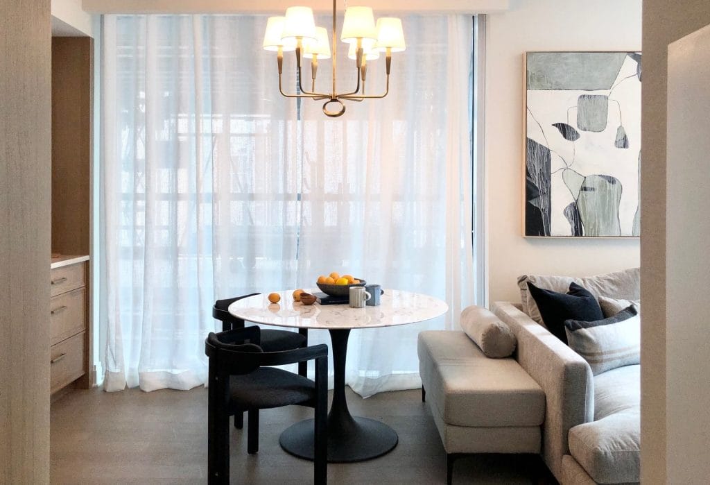
In greige interiors, furniture pieces should occupy different values. Think this way: a room full of nearly identical mushroom tones will feel flat or dull no matter how good each item looks on its own.
Greige furniture gives you plenty of room to vary the palette within a seating group. A pale sofa can sit beside a mushroom-colored armchair, with the deeper shade giving the chair its own presence. The difference should be visible from across the room; small tonal shifts often disappear once the pieces are separated. Shape matters too, since a sofa upholstered to the floor carries more visual weight. Beside generous seating, a table with slender legs leaves more of the floor visible. That space between pieces helps closely related neutrals remain distinct.
As for pattern, a striped cushion can connect the greige to a stronger color elsewhere in the room, while a patterned ottoman introduces variation across a larger surface. You don’t need to repeat it on every seat. Leaving some upholstery bare gives the fabric itself a place in the composition.
For greige home decor, consider what each piece sits against—placement determines how much an accent contributes. Always keep in mind that metals can shift the palette.
Greige Home Decor: Textures, Accents & Finishing Touches
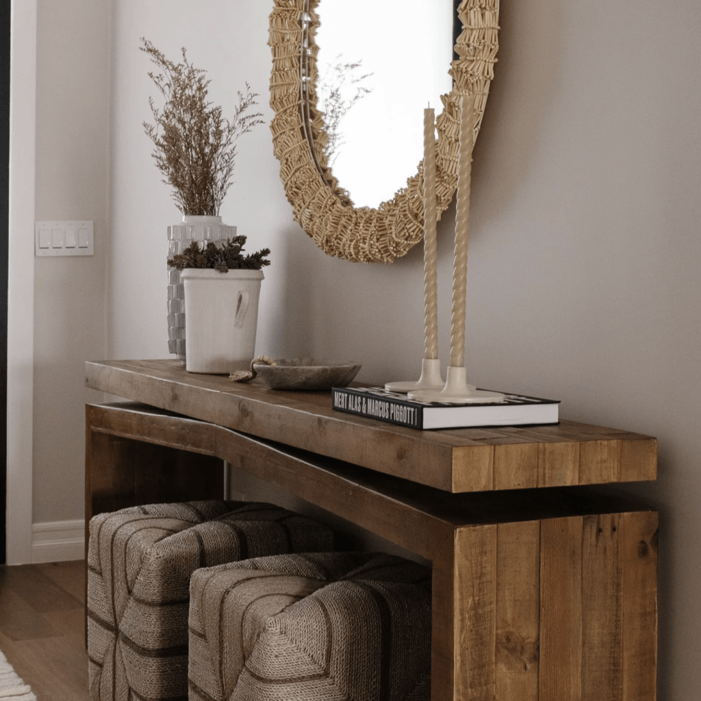
Once the major surfaces are in place, greige home decor should add distinction, not more of the same. This is the stage where a room either gains character or drifts into a blur of similar neutrals.
Contrast at the edges is often enough, such as a dark frame against a pale wall, or a glossy finish that catches light in a completely different way. Greige relies heavily on subtle value changes, so even a small reflective surface can stop the room from feeling flat. Also, there is no need to scatter the same accent around the room just to prove that it belongs there. A smoky blue object on a console may be all the room needs, especially if that note already appears faintly in the artwork.
At eye level, be selective. Consider one strong piece of art or a mirror to reflect light back into the scheme. Both can change how the greige appears across the day.
Bring greige into your home
Choosing a greige paint is only one part of the room. The real work starts when that color meets your flooring, furniture, stone, and changing light. Book your Free Online Interior Design Consultation to discuss your room and the design support you need!


Comments